Guggenheim Art App
The Solomon R. Guggenheim Museum, often referred to as The Guggenheim, is an art museum located at the Upper East Side neighborhood of Manhattan, New York City. With its constellation of architecturally and culturally distinct museums, exhibitions, publications, and digital platforms, the foundation engages both local and global audiences.
Project Vision
For this project, I am creating an art app for the Guggenheim to attract more visitors, meanwhile try to understand the user journey for searching, booking and reviewing the visit on this app.
My goal is to design a user-friendly mobile product that can provide convenience to gallery visitors, create a deeper bonding with the Guggenheim lovers, therefore improve sales and public awareness for the Guggenheim.
The Problem
Guggenheim’s visitors cannot search, book or review visits in one platform.
The Goal
Design an app for the Guggenheim Museum that provide convenience to gallery visitors and build an online Guggenheim community.
My Role
UX designer: designing an app for the Guggenheim Museum from conception to delivery
Responsibilities
Conducting interviews, paper and digital wire-framing, low and high-fidelity prototyping, conducting usability studies, accounting for accessibility, and iterating on designs
Project Duration
August 2021 to November 2021
Understand The Challenges
I conducted interviews and created empathy maps to understand the users I am designing for and their needs. A primary user group identified through research was art lovers with great enthusiasm for the Guggenheim Museum. The user group agreed on the initial assumption about Guggenheim’s mobile app users, but research also revealed that searching process was not the only factor that makes art hard to approach. Other user problems included inconvenient admission ticket booking system and the incapability to share thoughts with others.
Searching
Platforms for searching art shows are not equipped with assistive technologies.
Purchasing
Visitors cannot book multiple shows on different dates at the same time.
Sharing
There is no platform for Guggenheim members to share thoughts and feelings with others.
Problem Statements
Min is a young art lover who relies heavily on her phone to book and document every gallery visit.
Andrew is an enthusiastic art history professor who needs a more accessible art sharing platform because he wants to share art with others.
User Journey
I constructed a user journey map and a major UX design storyboards of what the persona Min would possibly experience with my design. Based on the storyboard, I made a user flow chart, which helped me understand ways users can possibly interact with the product while indicating the navigations through user goals.
Min’s user journey map revealed the importance of documenting the visit after gallery visits.
I sketched a storyboard about the idea scenario where the persona is actually using this app.
I constructed a user flow of what a basic start-to-finish journey looks like while using this app.
Competitor Analysis
Key Competitors
The product’s direct competitors is The Met, which considered to be the most well-known New York Museum. Other indirect competitors are Wiki Art, an online editable encyclopedia and Google Arts & Culture, an online platform..
Competitors’ weaknesses
Weak UI/UX design
Include too many commercials
Lack of visual attraction
Lack of trending artworks
Inconsistent use of images
Opportunities
None provides sharable community for users to share their opinions
None cannot track user’s visiting or viewing history
Provide online sharing community to freely share opinions
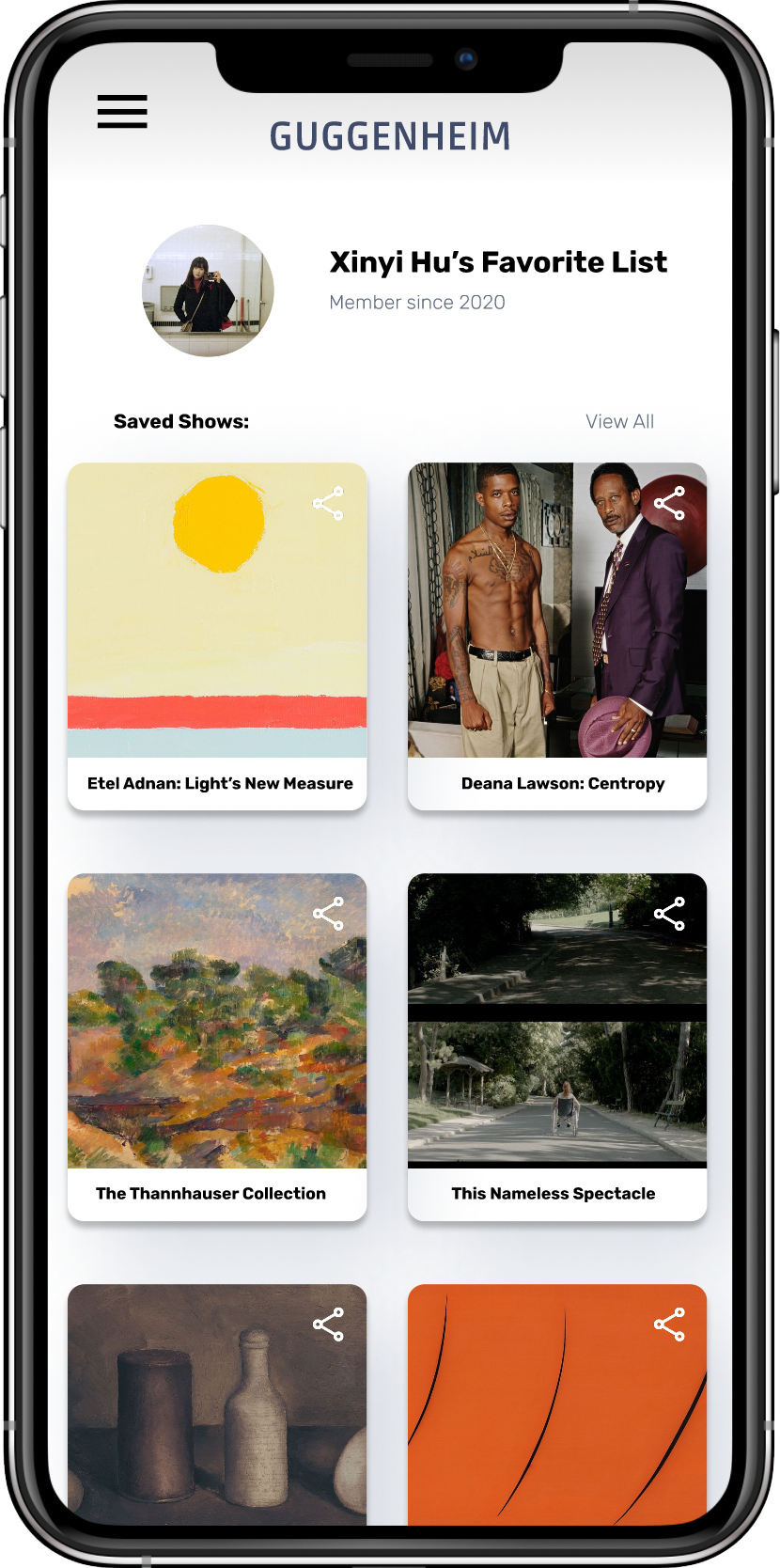
Offer tracking feature for users to track their visits and store favorite artworks in personal favorite list
Wireframes
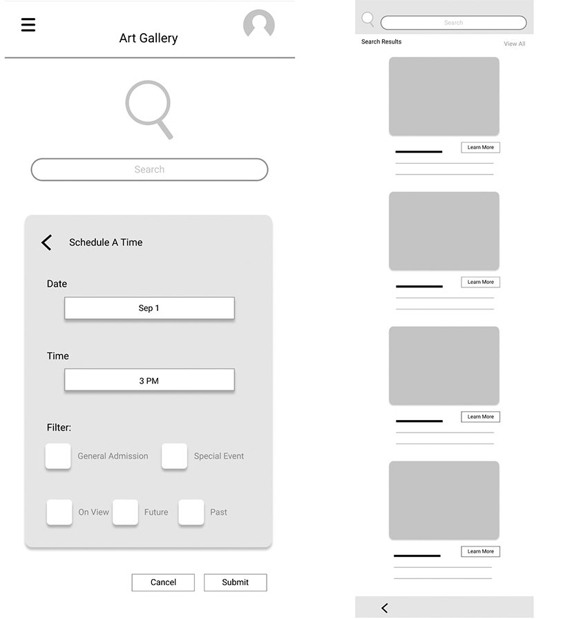
Taking the time to draft iterations of each screen on paper to ensure that the elements would be well-suited to address user pain points. For the home screen, I prioritized a quick and eye-catching searching process to help users save time.
Paper wireframes: home screen
Low-Fidelity Prototype
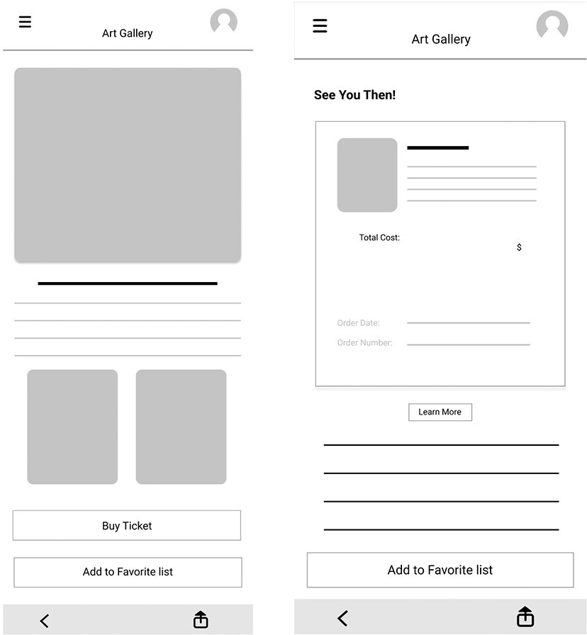
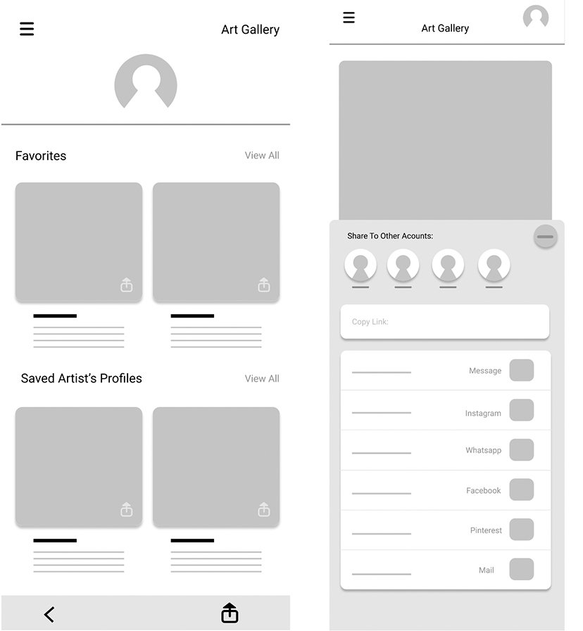
As the initial design phase continued, I made sure to base screen designs on feedback and findings from the user research. The low-fidelity prototype connected the primary user flow of using an art app for gallery visit, so the prototype can be used in a usability study with users.
Step 1
Step 2
Step 3
View the Art App: Low-fidelity Prototype
Iteration
To better understand how easy it is for users to complete tasks in the design, I conducted two rounds of usability studies. From Sep to Nov, I have interviewed 7 participants to run through different scenarios in my prototype. My primary goal is to figure out what specific difficulties users encounter when they try to complete the core tasks of the art App, meanwhile garnering enough feedback to use for the future set of design iterations. Insights from the first usability study helped guide the designs from wireframes to mockups. The second study tested out the high-fidelity prototype and revealed what aspects of the mockups needed refining.
1st Usability Study Findings
Users expect the app to be visual-driven.
Users need a better searching function.
Users want to double check before making the purchase.
Icons and texts are helpful when users try to make the next move.
2nd Usability Study Findings
Users prefer to type in information to search.
The checkout process has too many unnecessary elements.
The sharing function doesn’t lead to any destination.
Collected feedbacks
Design Progress
Early designs allowed users to get necessary information on the first glance. For the later design, I chose to emphasize on the images rather than the text. I also re-arranged the layout so users can find the search button easily when they first land on the screen.
Before Usability Studies
After Usability Studies
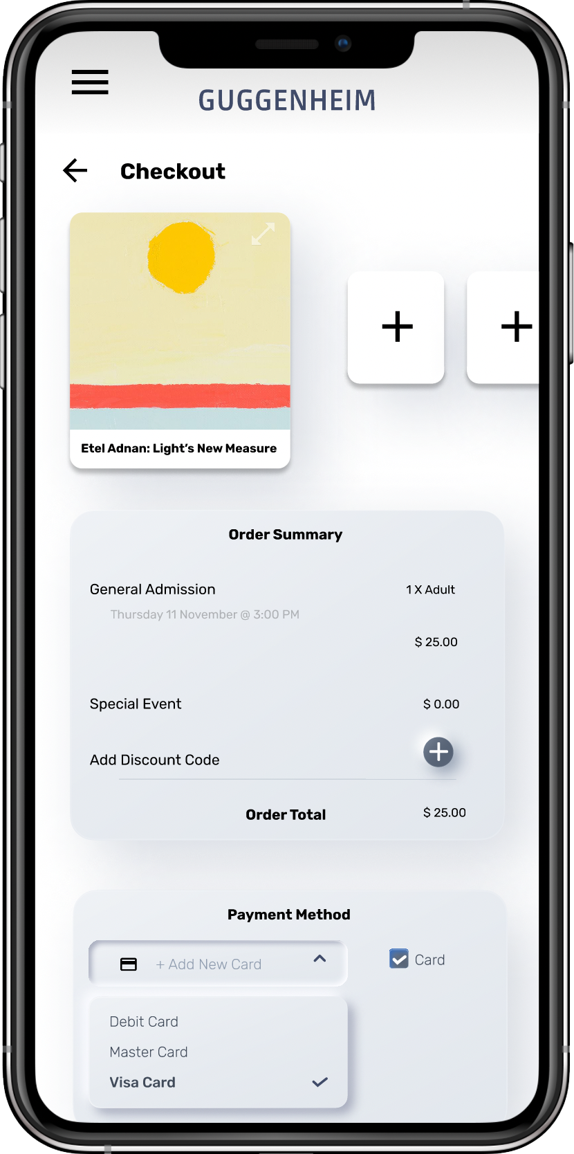
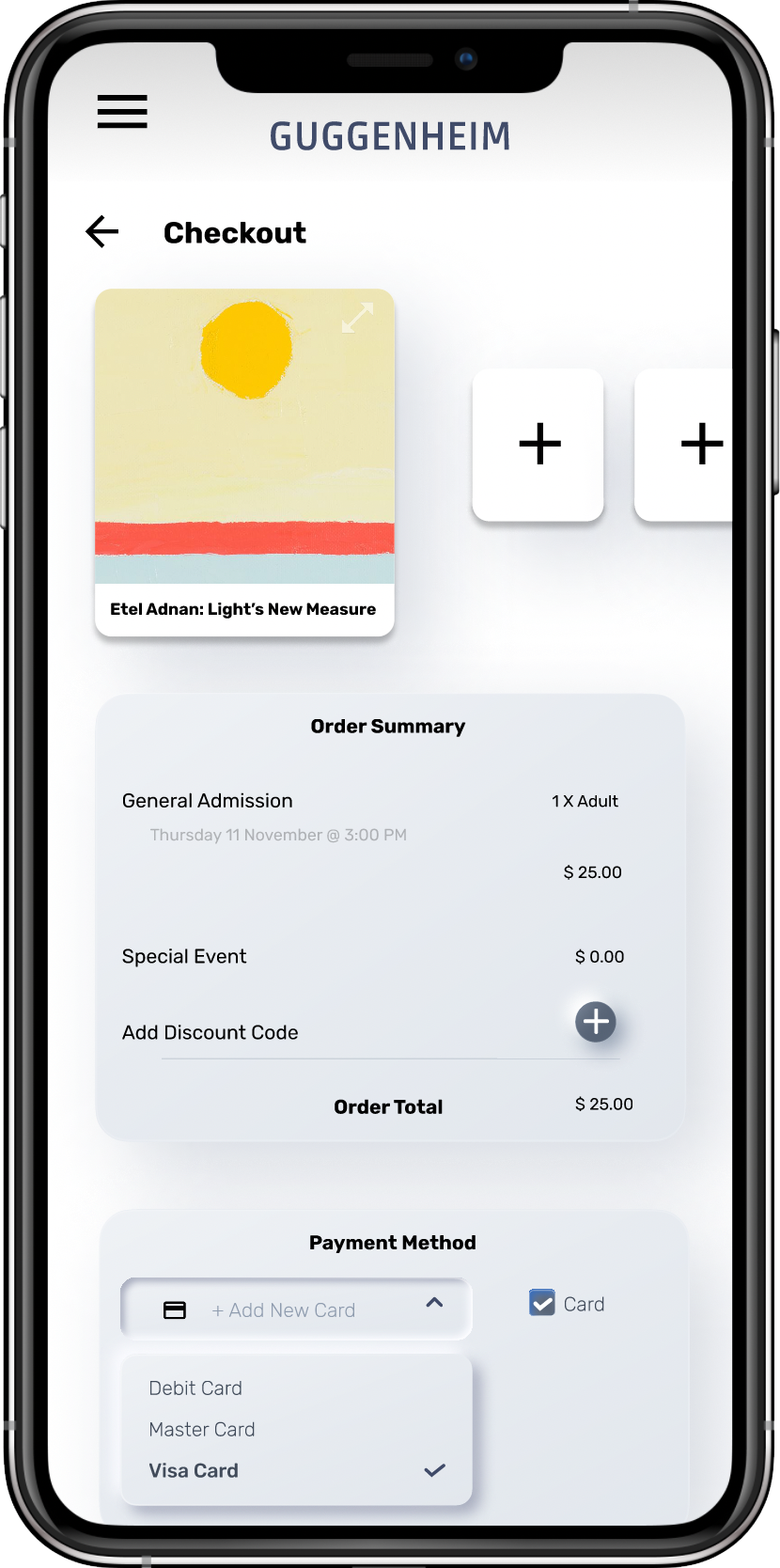
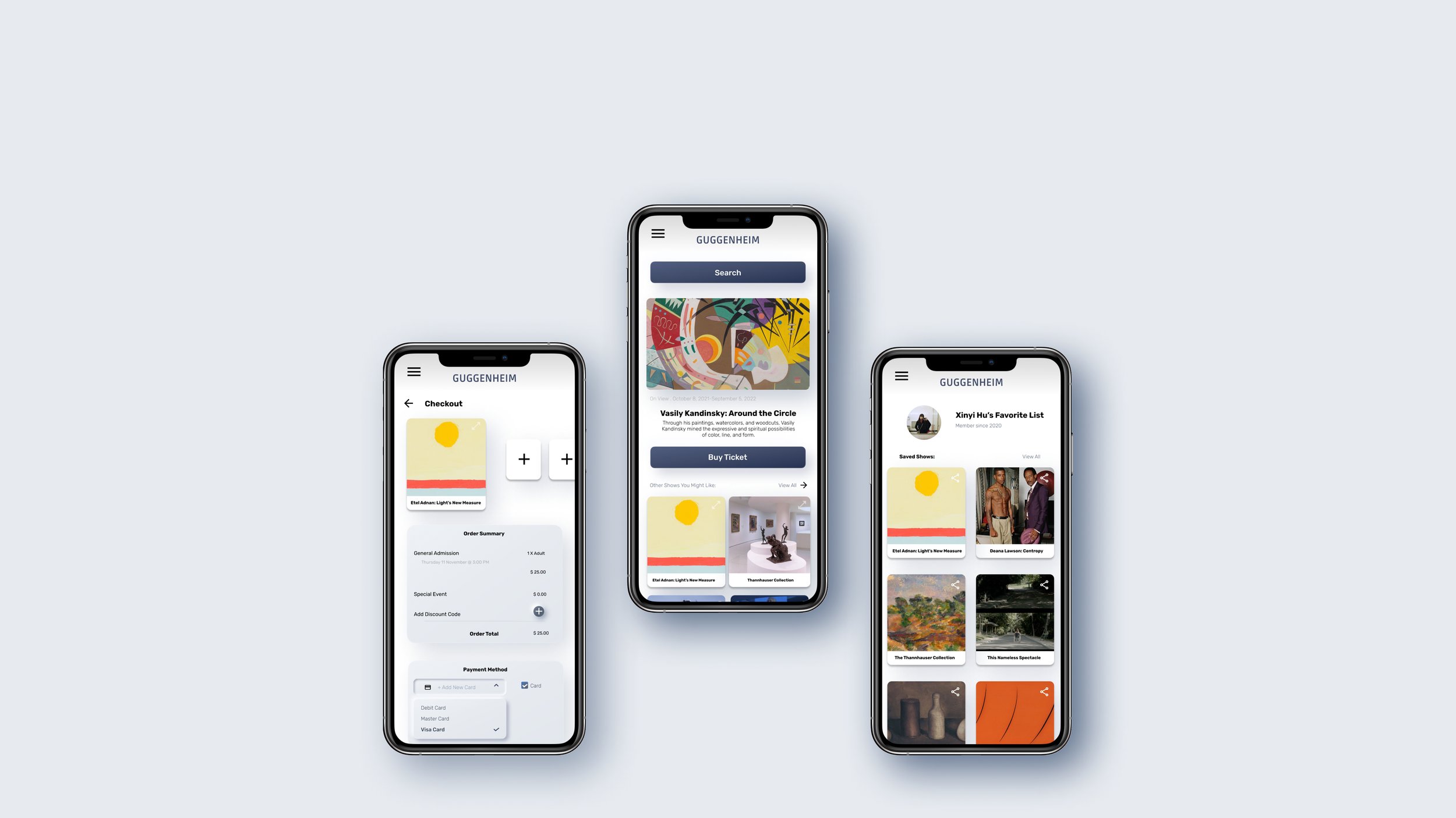
In the low-fidelity prototype, users can double check before making the purchase. After the usability study, I provided the option for users to add in more shows even from different date to the check out list. Also, I placed a payment option at the bottom.
Before Usability Studies
After Usability Studies
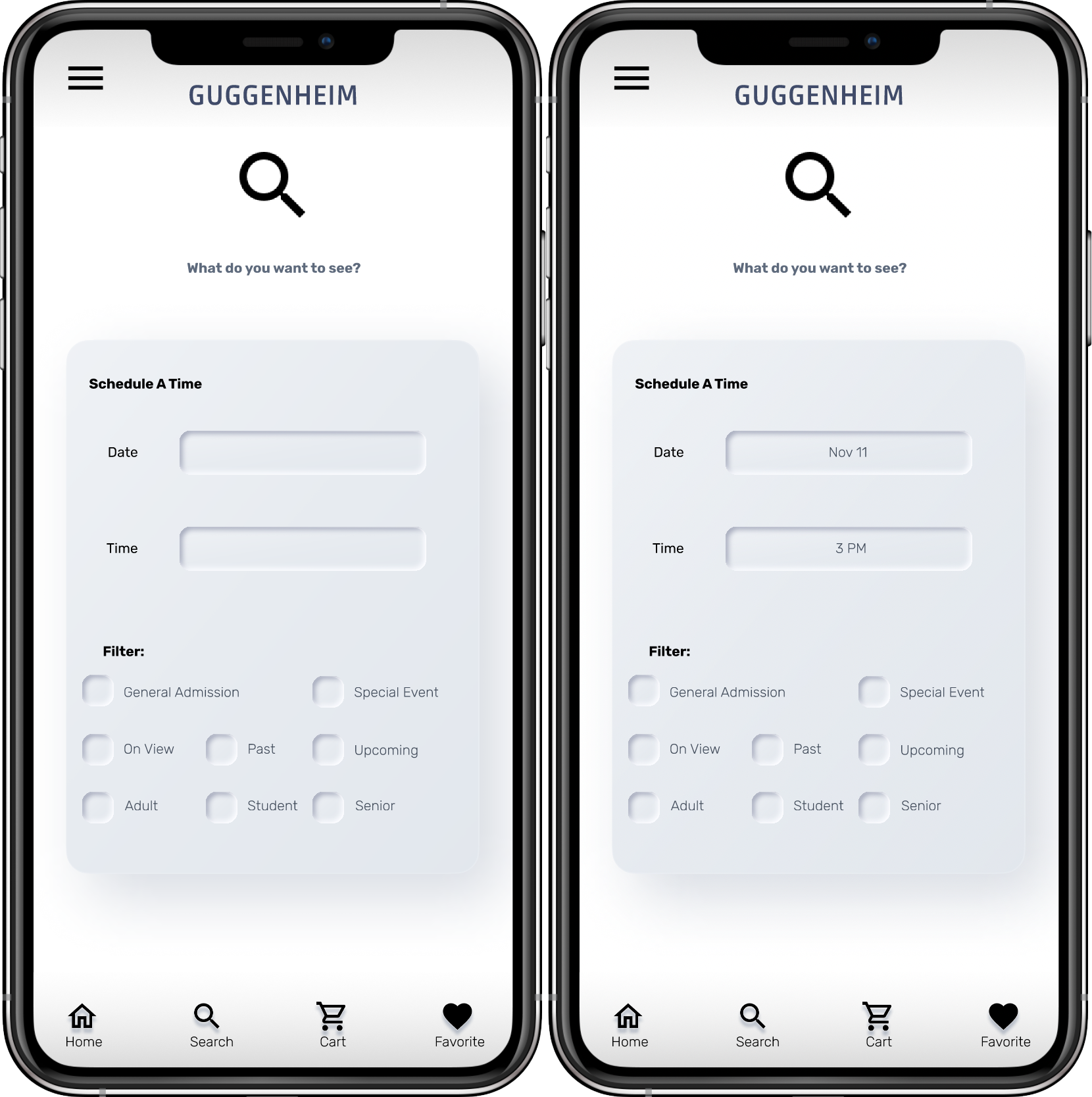
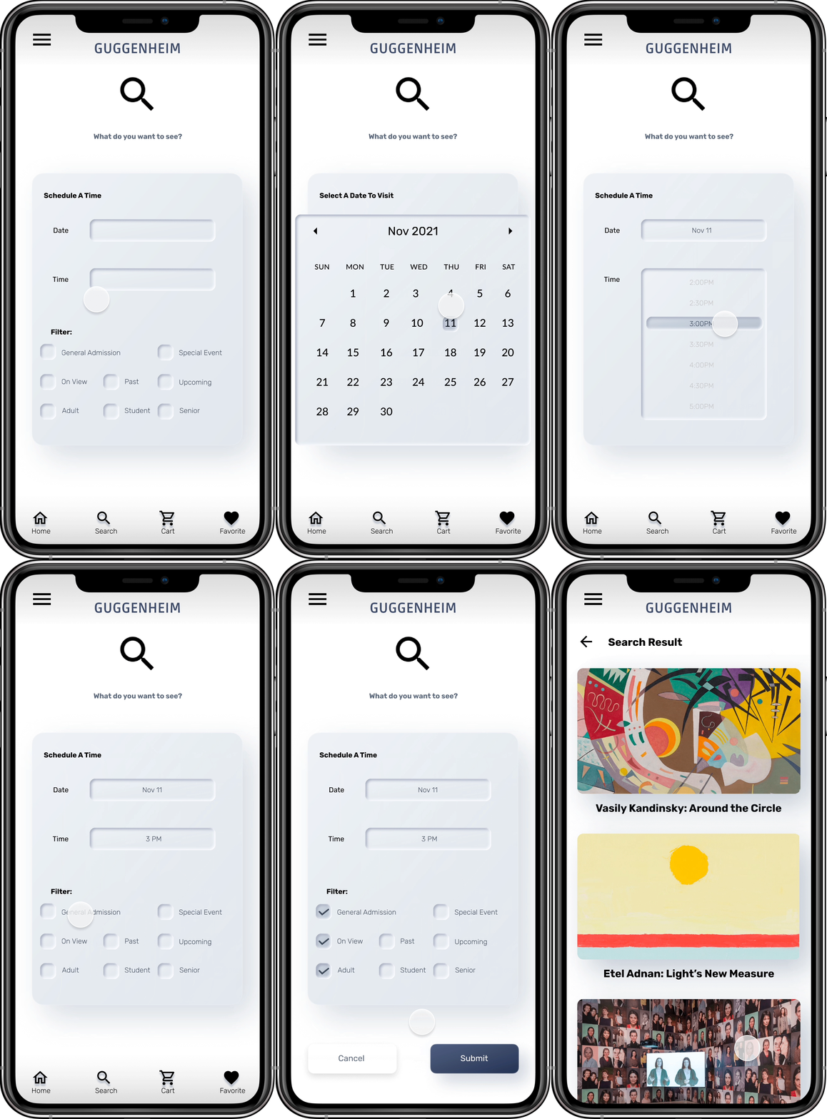
The second usability study revealed frustration with the search flow. To streamline this flow, I prioritized entering dates over selecting filters. I also added more filter options for users to select from.
Before 2nd Usability Study
After 2nd Usability Study
High-Fidelity Design
Provided access to users who have Dyslexia or users who are not fluent in English by adding more images.
Accessibility consideration
Used icons to help make navigation easier.
Used cohesive color palette and organized layout to remind users of the actual exhibition space.
View the App: High-fidelity Prototype
Solutions For Design Challenges
Challenge 1: Searching
In my design, the search function is prioritized at the top of the screen for users to search art shows. Along with the search function, the filter option allows users to personalize their research.
Challenge 2: Purchasing
My design allows users to book any current show within their searching range. Along with the checking out option, the “add more“ option ensures users to add in multiple shows even from different times.
Challenge 3: Sharing
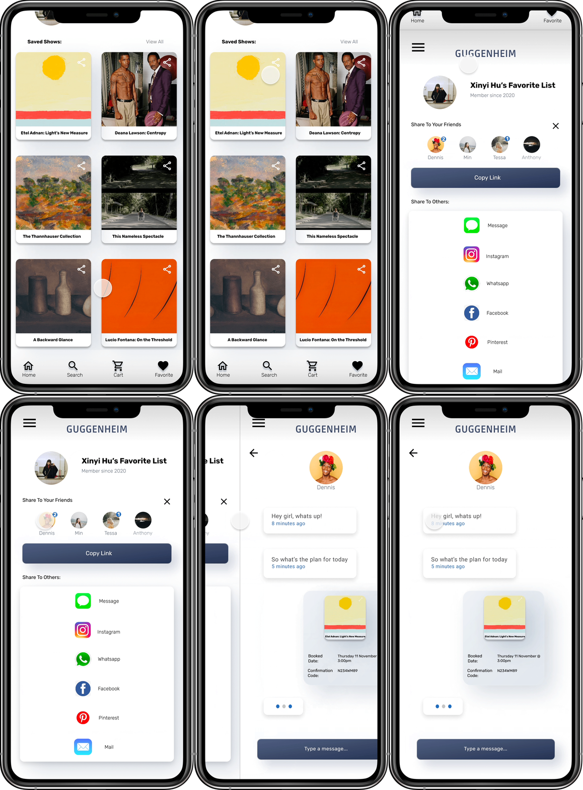
After users successfully booked their desired shows, they can share the show’s information with others, including inside members of Guggenheim museum, and outside users from other platforms.
Takeaways
Impact
Users think Guggenheim Art App can actually meet their needs, they enjoy the design as well. They are satisfied with the visual design, as well as the simple user flow. 6 out of 7 participants for our usability studies mentioned that they would like to use this App for actual gallery visits.
What I learned
This is my first UX design project. Working on the Guggenheim Art App project allowed me to fully practiced the design thinking rules I learned throughout the course. I realized that UX designers need to first empathize with users to ideate solutions for design problems. Another fact I discovered: in UX design process, research is as important as design.
Next Steps
Conduct another round of usability study to validate whether the pain points users experienced have been effectively addressed.
Communicate with Guggenheim Art Director to discuss more details about how the design can fit more with Guggenheim’s iconic representations and aesthetics.
Conduct more user research and competitive audit to determine any new areas of need.


