Save Paws- Animal Rescue Center Website Design
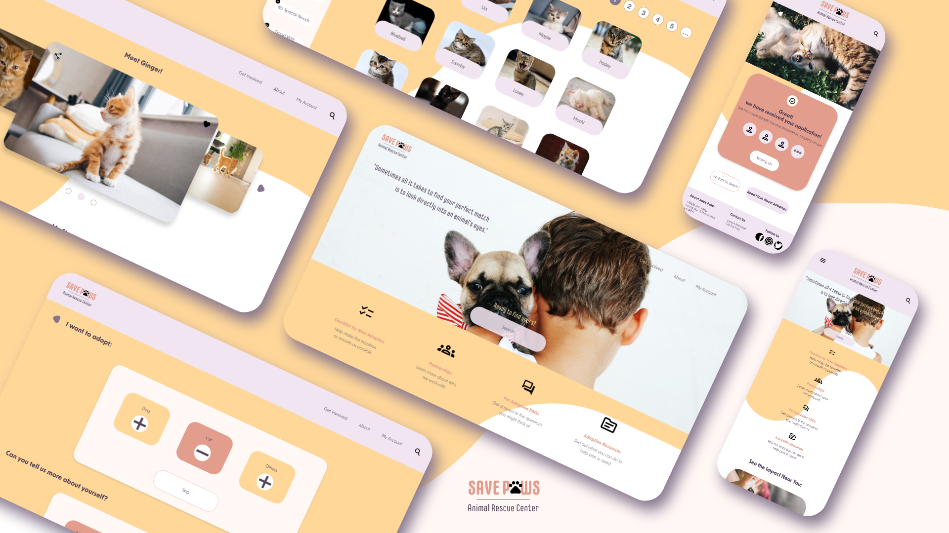
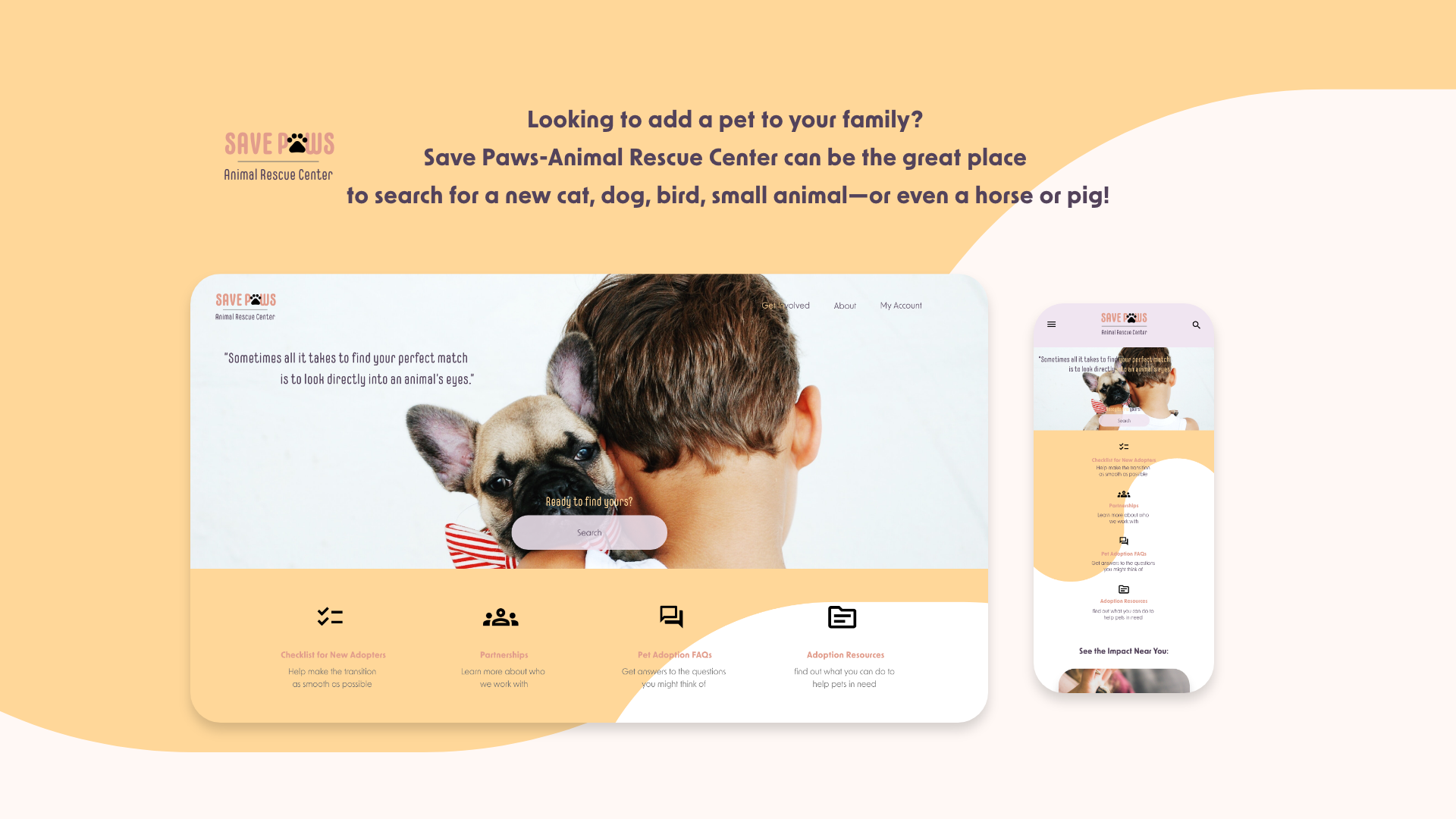
Save Paws is a website that helps pet lovers find the pet they want to adopt. The typical user for Save Paws are individuals with adoption interest, who are likely to visit animal shelters to help homeless animals. Save Paws’ goal is to make adoption process fast and easy for all types of users.
My Role
UX designer designing the product from conception to delivery
The Project
Responsive Website Design
Duration
November 2021- December 2021
Project Overview
The Problem
Available online animal adoption websites have cluttered designs, inefficient systems for browsing through available animals, and missing application process.
The Goal
Design an animal adoption website to be user friendly by providing clear and smooth navigation and offering a fast adoption process.
Starting off, I conducted interviews to understand the users I am designing for and their needs. A primary user group identified through research was pet lovers who are looking for adopting new pets. The user group agreed on the initial assumption about the difficulty to find the perfect match on these pet adoption websites, but research also revealed that cluttered navigation and layout was not the only factor that prevents people from browsing. Other user problems included insufficient information about the pets and the inconvenient waitlist system.
Meet The Users
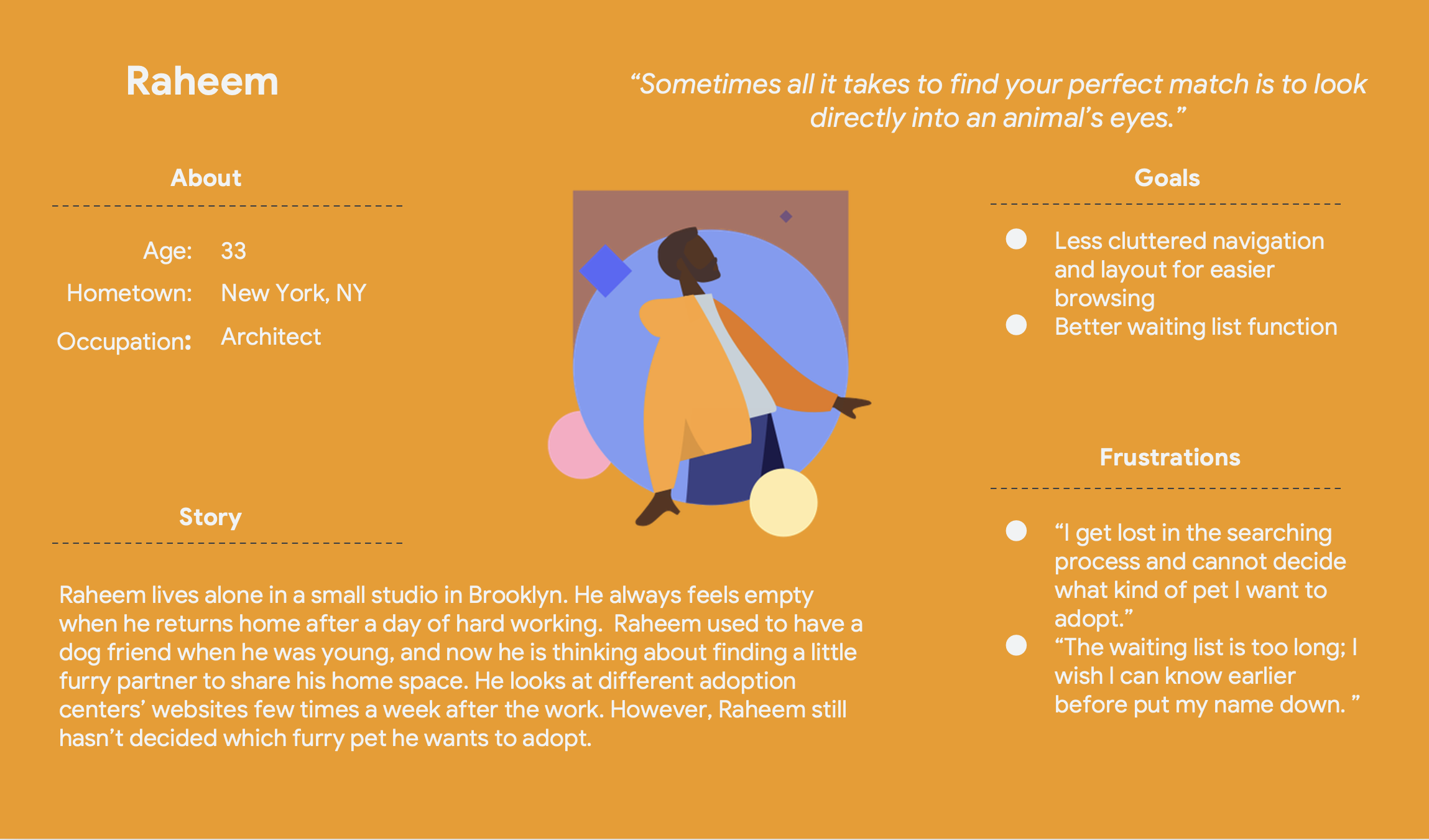
User 1: Raheem
Raheem is a busy architect who needs to easily find and adopt his perfect match pet online, because he wants the adoption process to be fast and easy.
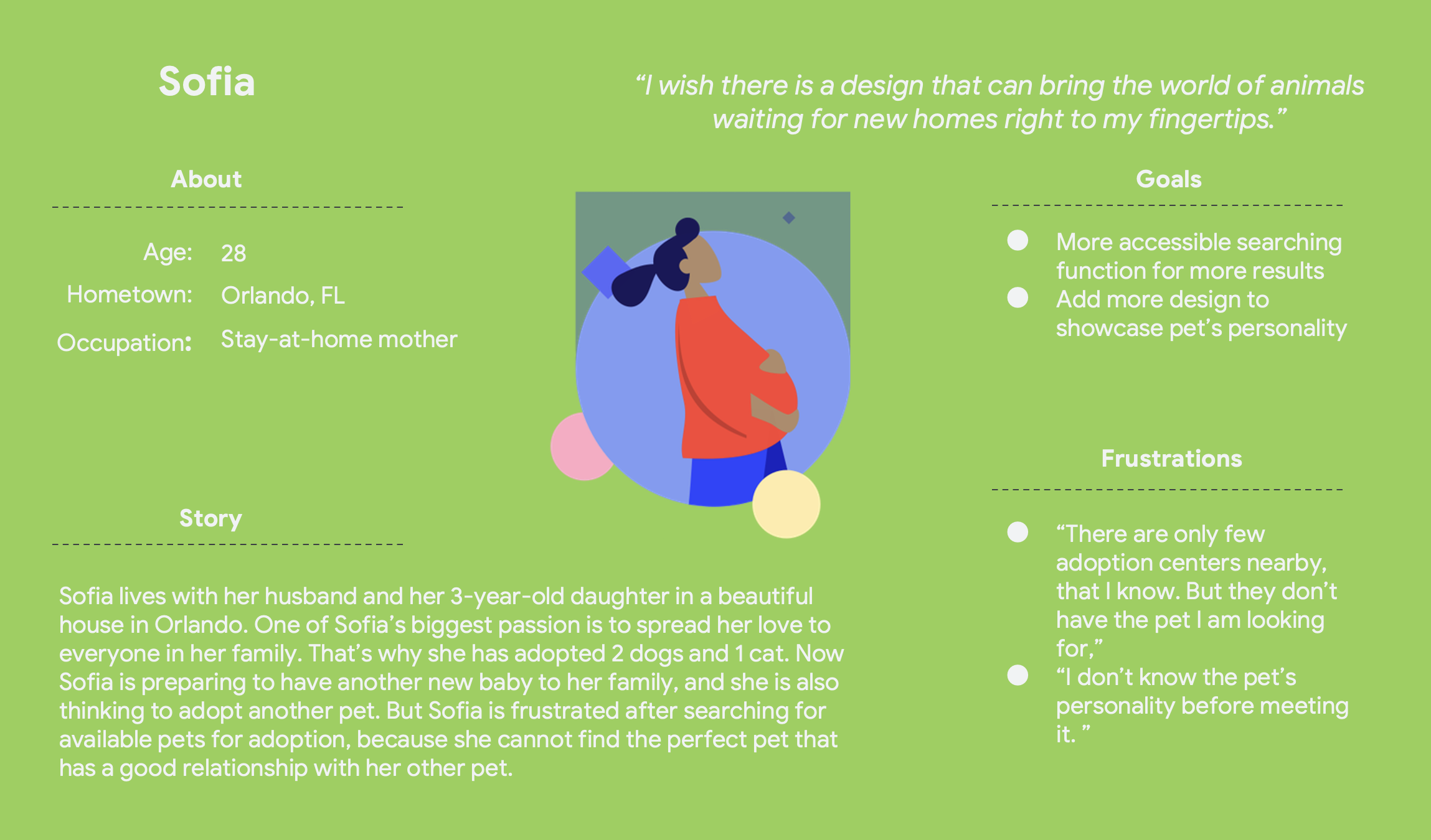
User 2: Sofia
Sofia is a pregnant wife who needs to search a pet with good personality to get along with her other pets, because she can only get limited access to available pets in local shelters.
User’s Pain Points
Process: Time
Working adults are too busy to spend after-work hours on finding available pet adoptions
Interaction: Empathy
Platforms for pet adoption don’t provide an engaging adoption process
Product: Accessibility
Cluttered navigation and layout are often difficult to browse
Competitive Analysis
In order to construct a concise and solid foundation for Save Paws, I had to venture out and see what the prominent adoption websites were already doing and what user goals they were not reaching. Our key competitors are ASPCA, Pestmart Charities and Petfinder which are nationwide animal help companies, and Philly Paws, Grace Animal Rehab Center which are local animal rescue centers. ASPCA, Pestmart Charities, Petfinder, Philly Paws and Grace are direct competitors to pet adoption, and Chewy is an indirect competitor.
Competitive Audit Goal
Compare the browsing and pet adoption flow of each competitor's site
Gaps
Many local pet adoption centers are not equipped with mobile app
Browsing features for many websites are cumbersome and not helpful
Opportunities
Create fully responsive design
Provide easy access to personalized search function
Support browsing through high-quality imagery and clean IA
Optimize design for screen reader usage
Include compelling stories to engage with local communities
Sitemap
Difficulty with website navigation was a primary pain point for users, so I used that knowledge to create a sitemap.
My goal here was to make strategic information architecture decisions that would improve overall website navigation. The structure I chose was designed to make things simple and easy.
Paper & Digital Wireframes
Paper Wireframes
Based on the sitemap, I sketched out few paper wireframes, with the focus on the user pain points about navigation, accessibility and interaction. For the home screen, I prioritized a quick and easy searching process to help users save time.
Digital Wireframes
As the initial design phase continued, I made sure to base screen designs on feedback and findings from the user research. Moving from paper to digital wireframes made it easy to understand how the re-design could help address user pain points.
Screen Size Variations
Because Save Paws’ customers would access the site on a variety of different devices, I started to work on designs for additional screen sizes to make sure the site would be fully responsive.
Screen Size Variations
View the low-fidelity prototype here
Usability Study
To better understand how easy it is for users to complete tasks in my design, I conducted two rounds of usability studies.
Round 1 Findings
Users want a more customized search function with multi-selection.
Users expect the design to be visual-driven.
Users would like to have the function go back to the previous page anywhere.
Round 2 Findings
Users want bigger fonts for better browsing experience.
Users want to read more information after submitting application.
The color palette can be revised to emphasize the difference between primary and secondary buttons.
High-Fidelity Prototype
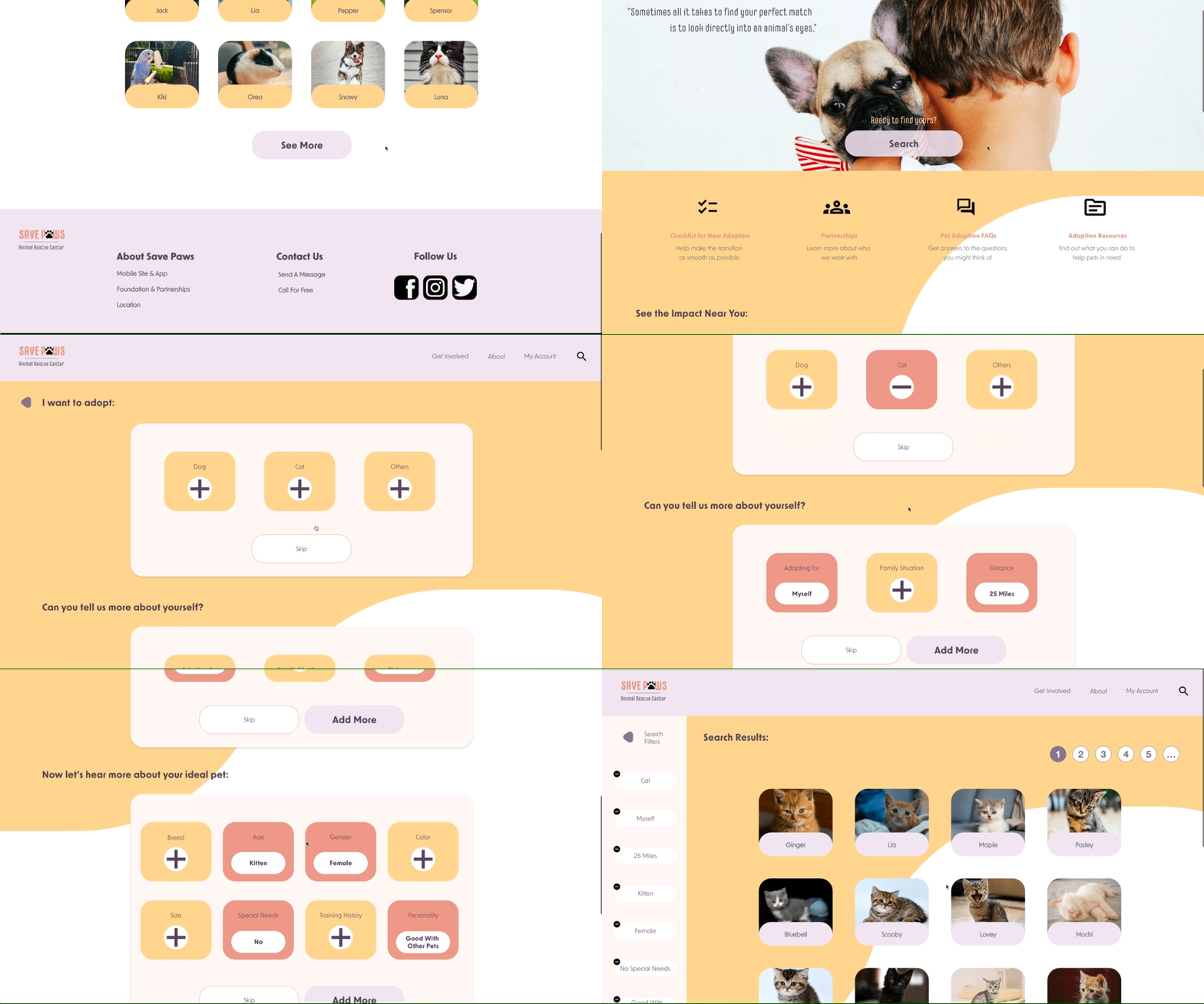
Based on the insights from the usability study, I made changes to improve the site’s user flow.
I included considerations for additional screen sizes in my mockups based on my earlier wireframes. Because users shop from a variety of devices, I understood that it was important to optimize the browsing experience for a range of device sizes, such as mobile and tablet so users have the smoothest experience possible.
View the high-fidelity prototype here:
View the mobile high-fidelity prototype here:
Solutions For Design Challenges
Challenge 1: Time
In order to save time for users to complete the adoption flow, I simplified the adoption process. I took off unnecessary adoption questions, categorized information into sections and added more open-ended questions for users to be creative. At the end of the application, I added the waiting list function for users to check their adoption status and have an estimated time-range to expect the decision of their applications.
Challenge 3: Accessibility
I used headings with different sized text for clear visual hierarchy, as well as primary and secondary designs to help users navigate the site. Meanwhile, I added multiple-selection option in the filter function to ensure that users have more freedom and control to narrow down their search results.
Challenge 2: Empathy
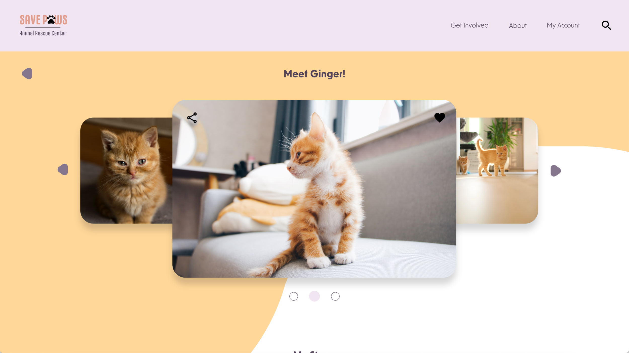
I designed the profile page of each pet to show each one’s personality. The narrative was written in a way as if the pet was telling its own story. I used a more engaging and heart-touching tone for users to emphasize with the pet and see the uniqueness. To ensure a better browsing experience for users, I used a bigger font and emphasized on the primary buttons to guide users through the user flow.
Takeaways
Impact
Our target users shared that the design was intuitive to navigate through, more engaging with the images, and demonstrated a distinct design style with clear visual hierarchy.
What I Learned
I learned that even the smallest design could vary depending on different screen sizes. After finishing this project, I am more familiar with the UX design thinking. In the future, I will always try to focus on solving real user problems with useful designs.
Next Steps
Conduct another round of usability study to validate whether the pain points users experienced have been effectively addressed.
Identify any additional areas of need and ideate on new features
Communicate with local animal shelters to discuss future collaboration opportunities

