Care- Health Care App For Local LGBTQ Community
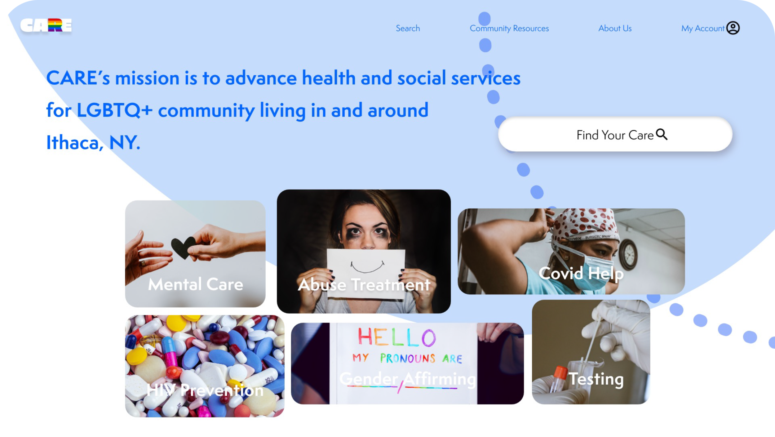
The Care center for Lesbian, Gay, Bisexual, Transgender, Queer+ Health and Wellness is a healthcare provider. Care’s mission is to advance health and social services for LGBTQ+ community living in and around Ithaca, NY.
My Role
UX designer designing from conception to delivery.
The Project
Mobile app and responsive website design
Duration
December 2021 to January 2022.
Project Overview
The Problem
Local LGBTQ community healthcare center provides limited healthcare services with cluttered navigation.
The Goal
Design a solution for local LGBTQ community in Ithaca, NY area to provide better, more inclusive healthcare services.
Understand The Users
Research
The LGBTQ (lesbian, gay, bisexual, transgender and queer) community receives poor quality of care due to stigma, lack of healthcare providers’ awareness, and insensitivity to the unique needs of this community.
The general health care providers don’t have proper training for the special care. The guidelines need to be developed into practice, in order to provide a more comprehensive, scientific and humane care for this community.
Vision
Understand, Respect and Trust
Understand the LGBTQ community’s essential need
Respect every individual’s uniqueness
Trust each other in a safe, confidential space
User Interview
Starting off, I asked myself a few initial questions. Who is our primary user? What kind of goals do they have? Why would someone want to use this application? To find answers for these questions, I conducted interviews and created empathy maps to understand the users I’m designing for and their needs. A primary user group identified through research was people from local LGBTQ community who need healthcare. The feedback received through interviews made it very clear that users would love to have access to local cares if they had access to an easy-to-use tool to help guide them.
Participants
Age 15-60
From LGBTQ community
Need healthcare services from local healthcare center
Outcomes from Affinity Maps
8 participants
20+ quotes
2 personas
3 user pain points
Interview Questions
How often do you need to see a doctor or a therapist?
What type of healthcare service do you need?
What is your scheduling process?
What is the most difficult part about seeing a doctor for you?
What challenges or concerns do you have for visiting doctors?
Is there any way in which you feel the challenges can be resolved?
Meet The Users
Persona 1: Joanne
Persona 2: Adan
User’s Pain Points
Product-Information
Local LGBTQ healthcare platforms provide limited information about the local doctors.
Product- Insurance
People from local LGBTQ community need in-network insurance coverage for their healthcare services.
Process-Navigation
Healthcare website designs are often busy, which results in confusing navigation.
Competitive Audit
Here is an audit of a few competitor’s products provided services to local LGBTQ communities.
Information Architecture
Sitemap
With all the information I collected from both users and competitors, I created this sitemap to show how pages are prioritized, linked and labeled. This allows me to think about the information architecture of a web that I can possibly develop in the future. I used the sitemap to guide the organizational structure of each screen’s design to ensure cohesive and consistent experience across devices.
Paper & Digital Wireframes
Paper Wireframes
I did a quick ideation exercise to come up with ideas for how to tackle the pain points. My focus was specifically on providing customized services to users.
Digital Wireframes
These designs focused on providing the smooth booking service for users to quickly book and track their appointments.
Digital Wireframes
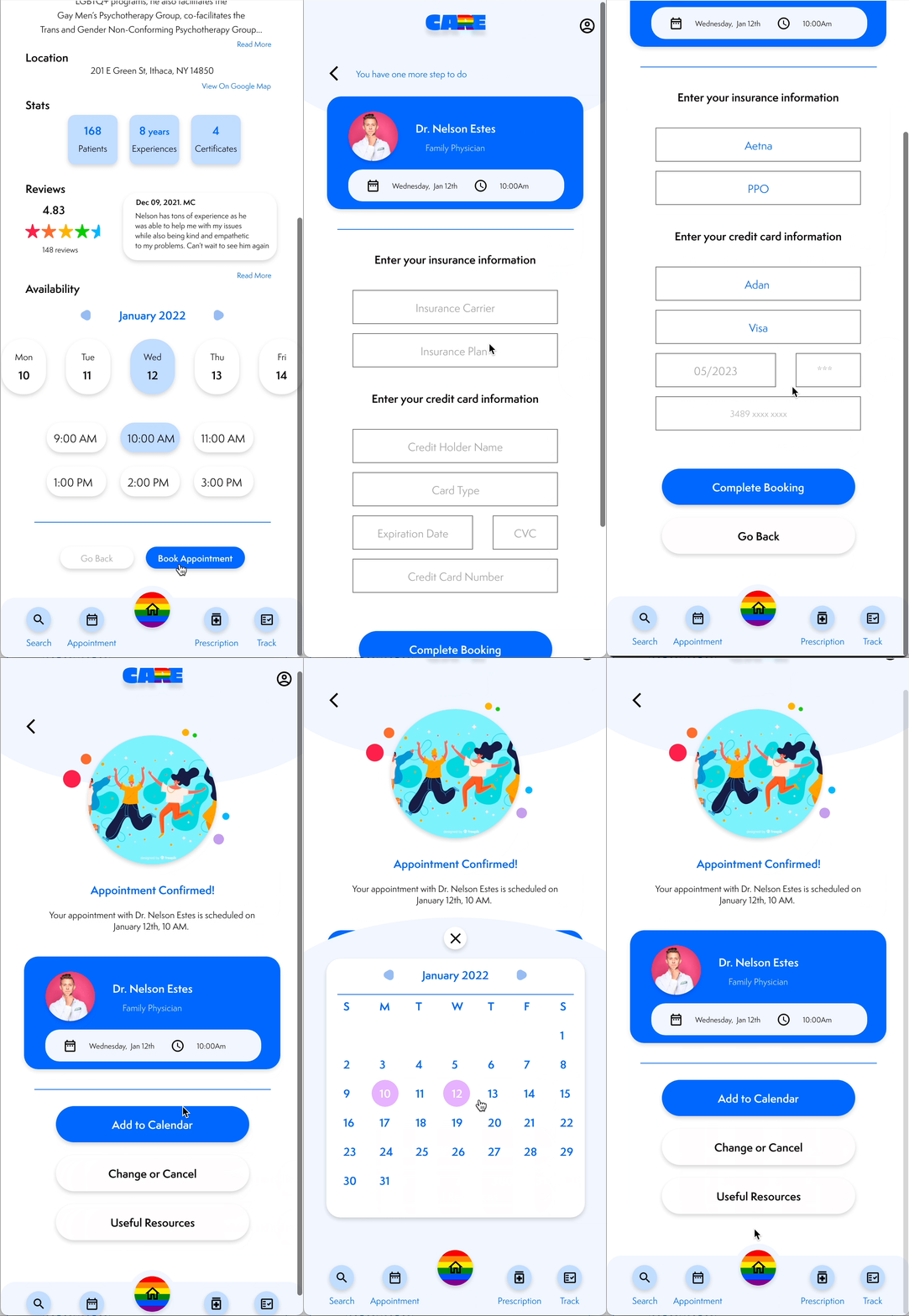
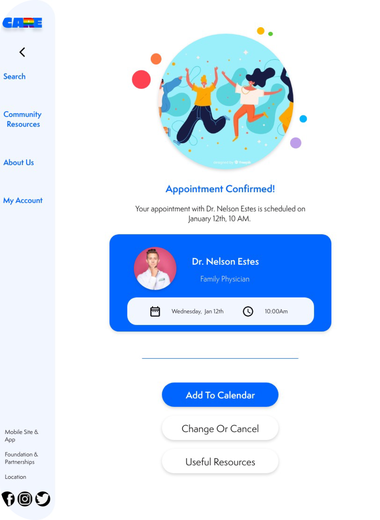
On the confirmation page, users can view booked appointments in their calendar
view the low-fidelity prototype:
Usability Study
To better understand how easy it is for users to complete tasks in my design, I conducted two rounds of unmoderated usability studies with a total of 7 participants from Ithaca, NY. Insights from the first usability study helped guide the designs from wireframes to mockups. The second study tested out the high-fidelity prototype and revealed what aspects of the mockups needed refining.
Participants:
7 participants
Location:
Remote
Round 1 Findings
The navigation bar doesn’t have a button to return to home screen.
Users expect to see detailed feedbacks on doctor’s profile page.
Users want to change or cancel the confirmed appointments.
Study Type:
Moderated Usability Study
Length:
10-15 minutes
Round 2 Findings
The color palette should be calm, welcoming and supportive.
Users want to read more information after successfully booking their visits.
Design Iterations
Based on the insights from the usability studies, I applied design changes like changing the main button from “Add” to “Home” on the navigation bar. Additional design changes included adding an option to “Change or Cancel” on the confirmation page, and providing detailed information about the booked appointment.
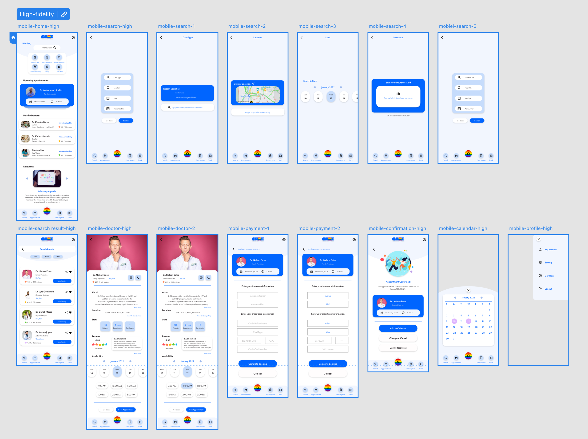
High-fidelity Prototype:
The high-fidelity prototype followed the same user flow as the low-fidelity prototype, including design changes made after the usability study.
View the high-fidelity prototype:

home page-mobile
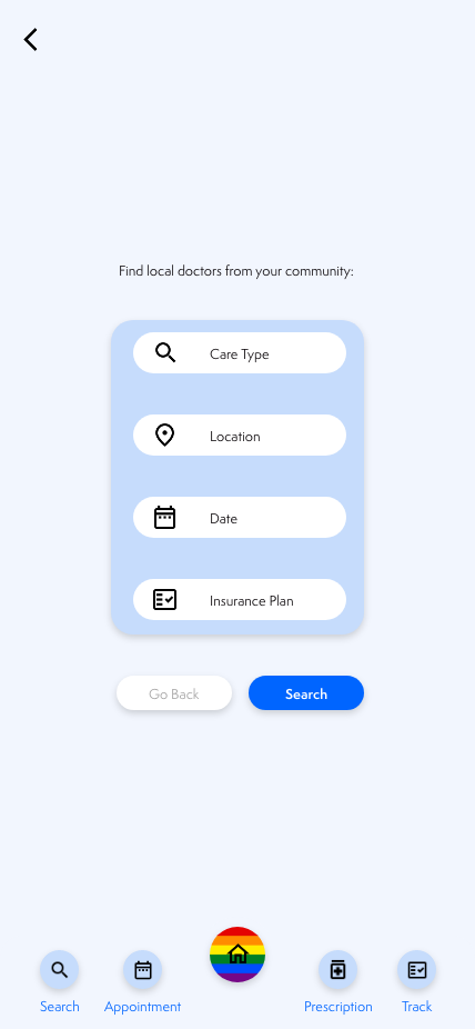
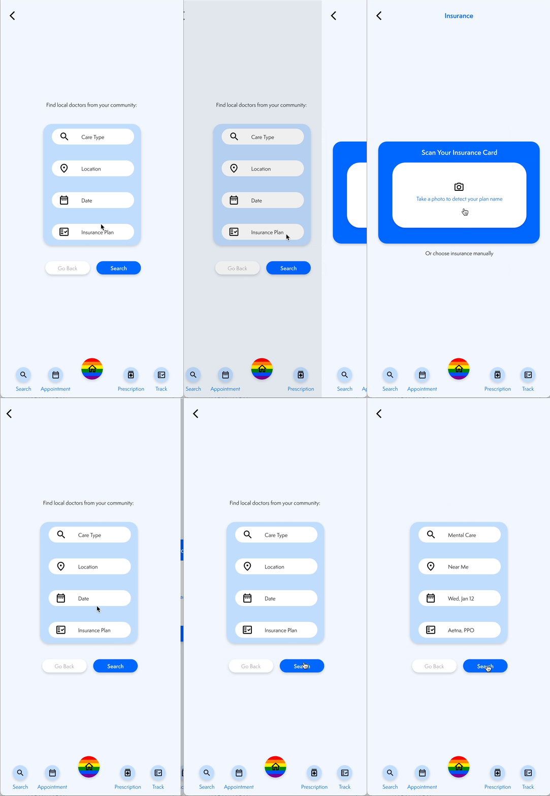
search page-mobile

search result page-mobile

profile page-mobile

payment page-mobile

confirmation page-mobile
Responsive designs
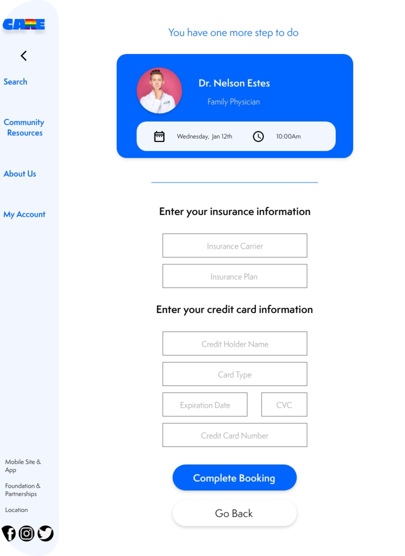
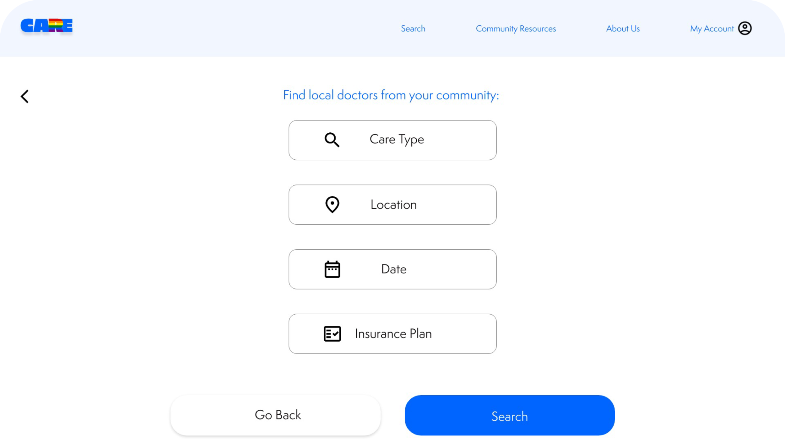
The designs for screen size variation included mobile, tablet, and desktop. I optimized the designs to fit specific user needs of each device and screen size.
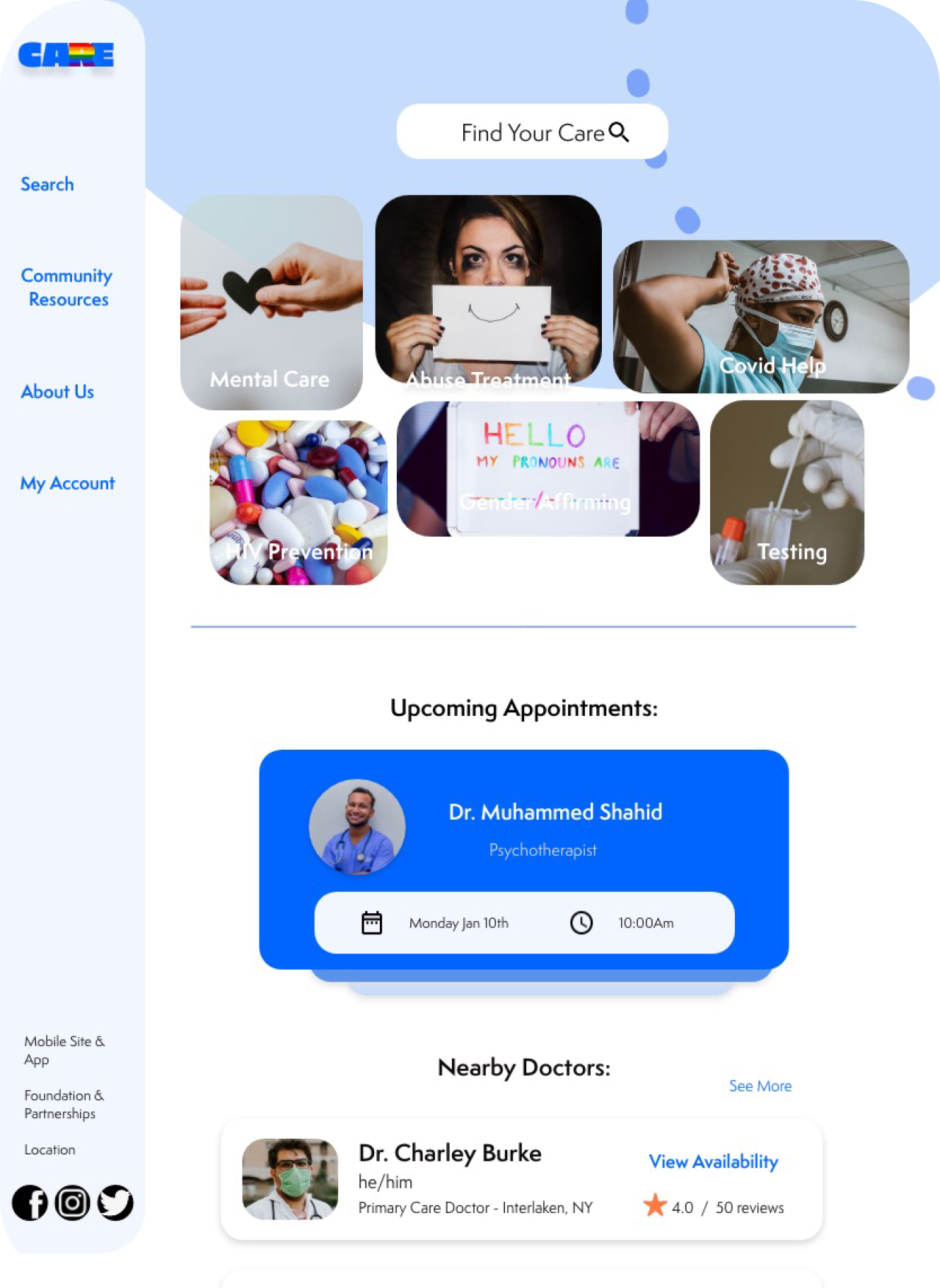
home page-tablet
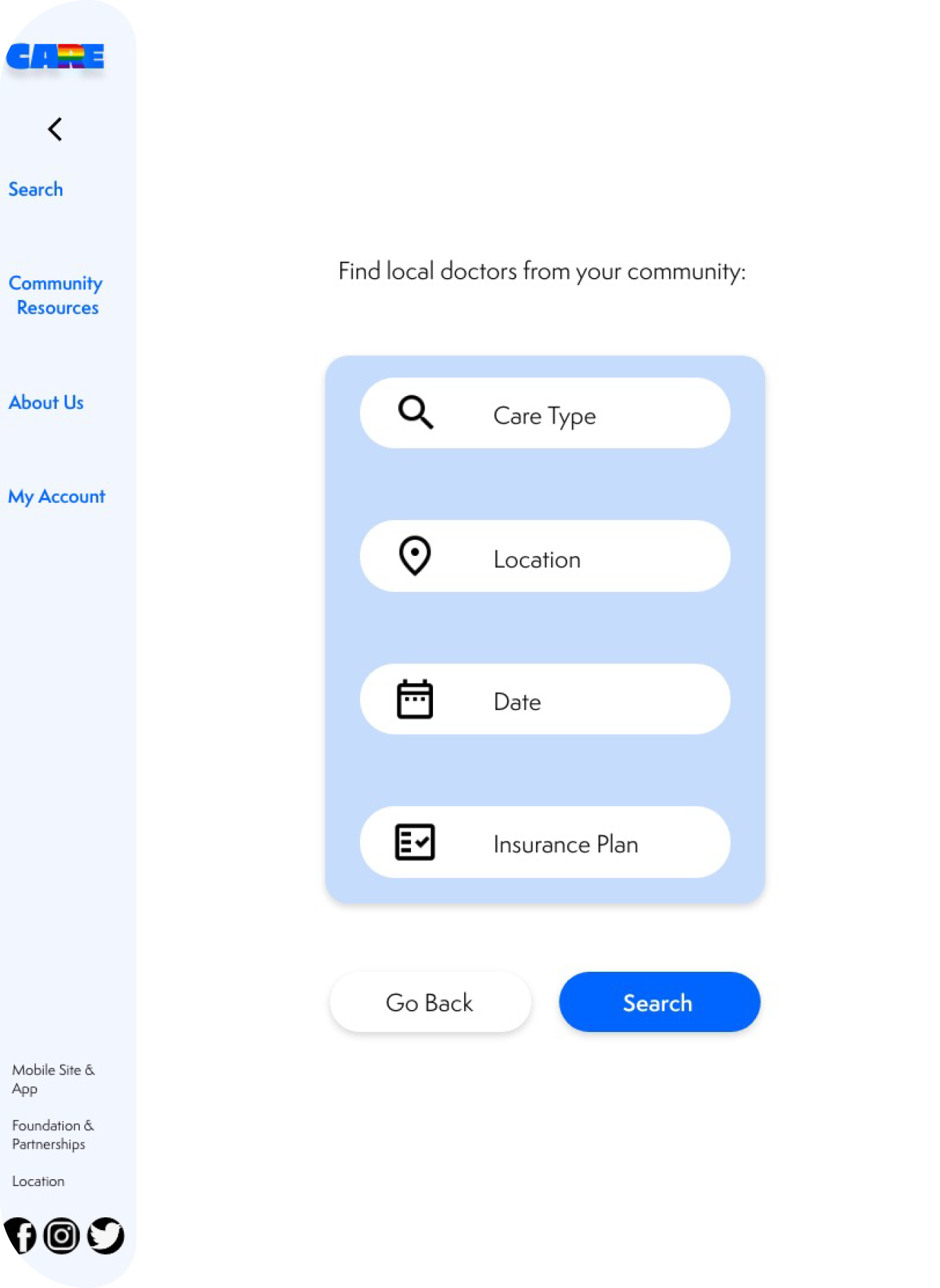
search page-tablet
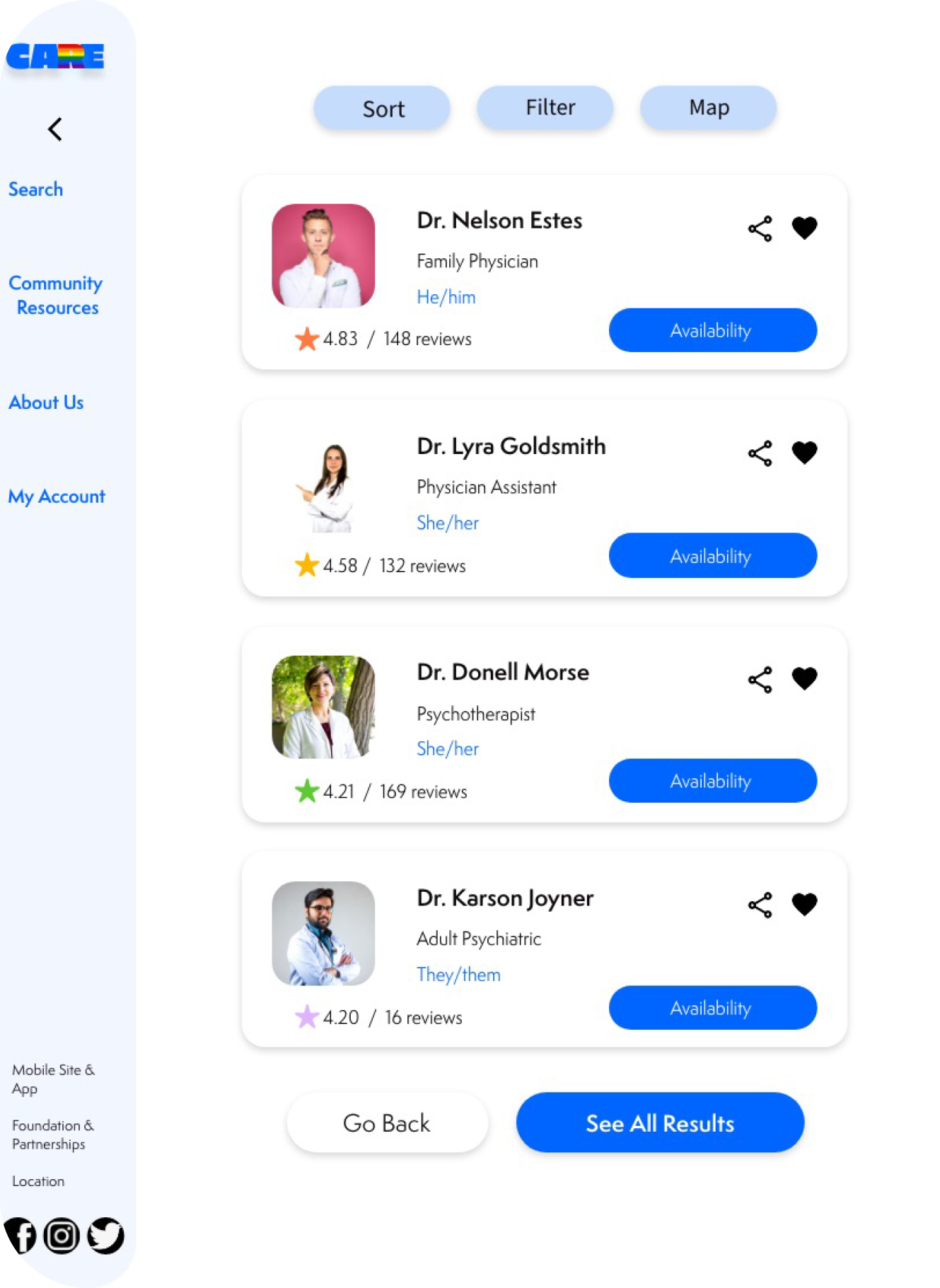
search result page-tablet
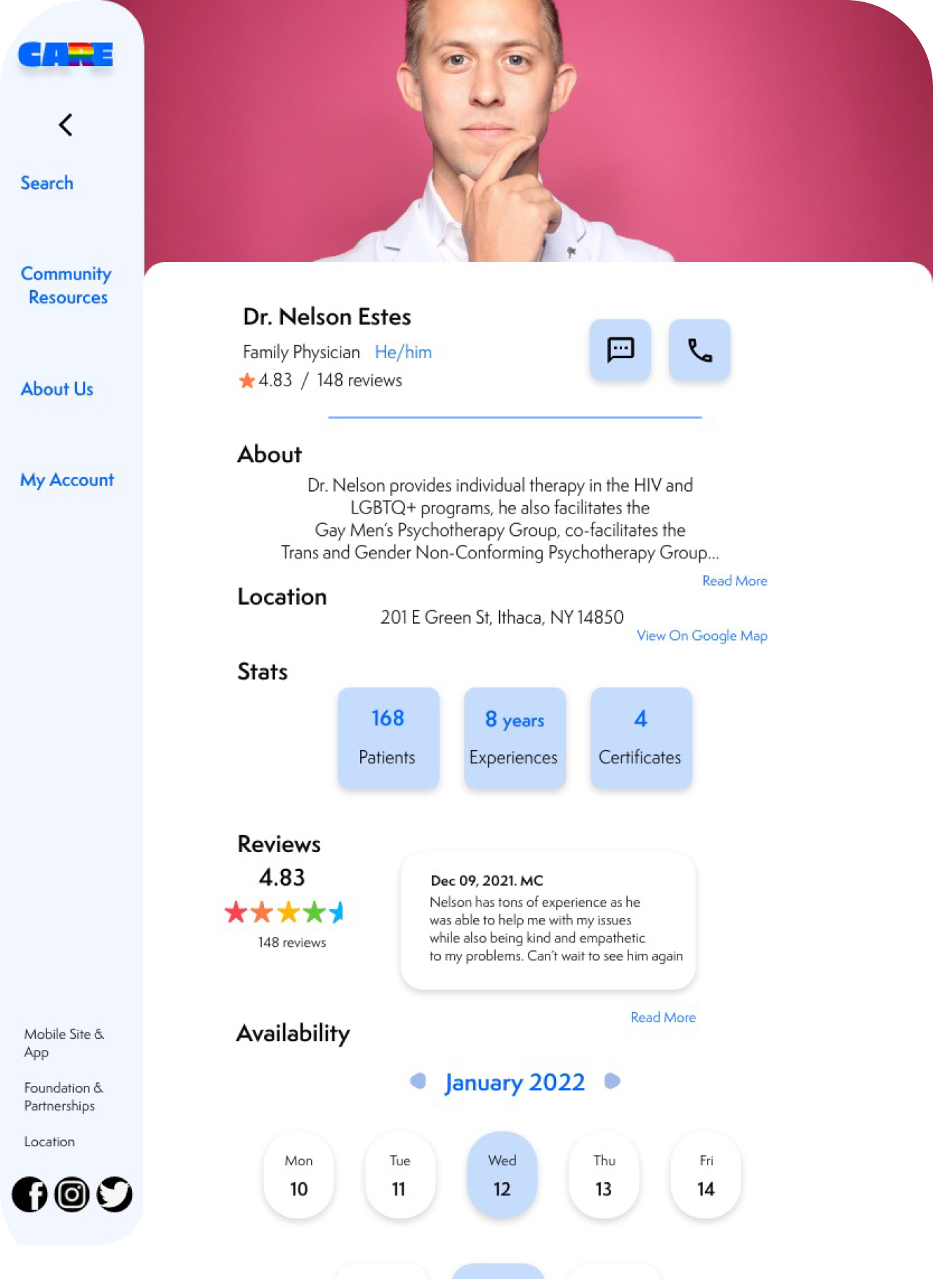
profile page-tablet
payment page-tablet
confirmation page-tablet
home page-website
search page-website
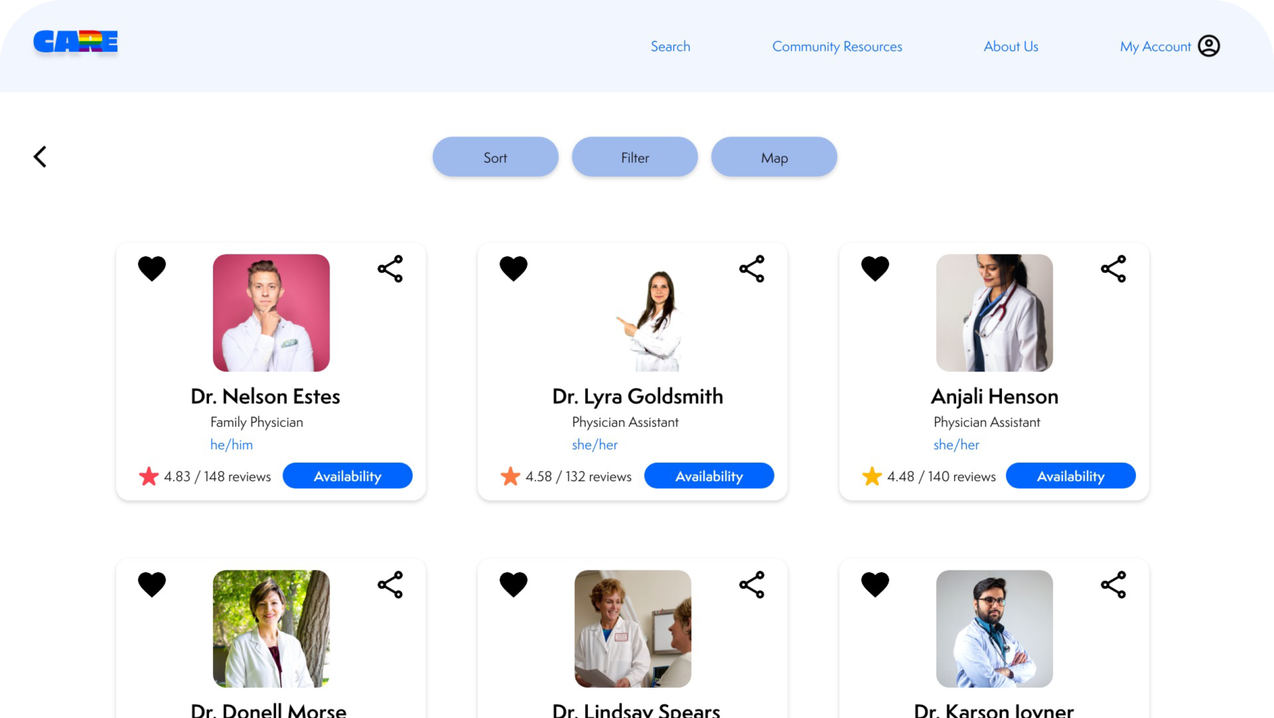
search result page-website
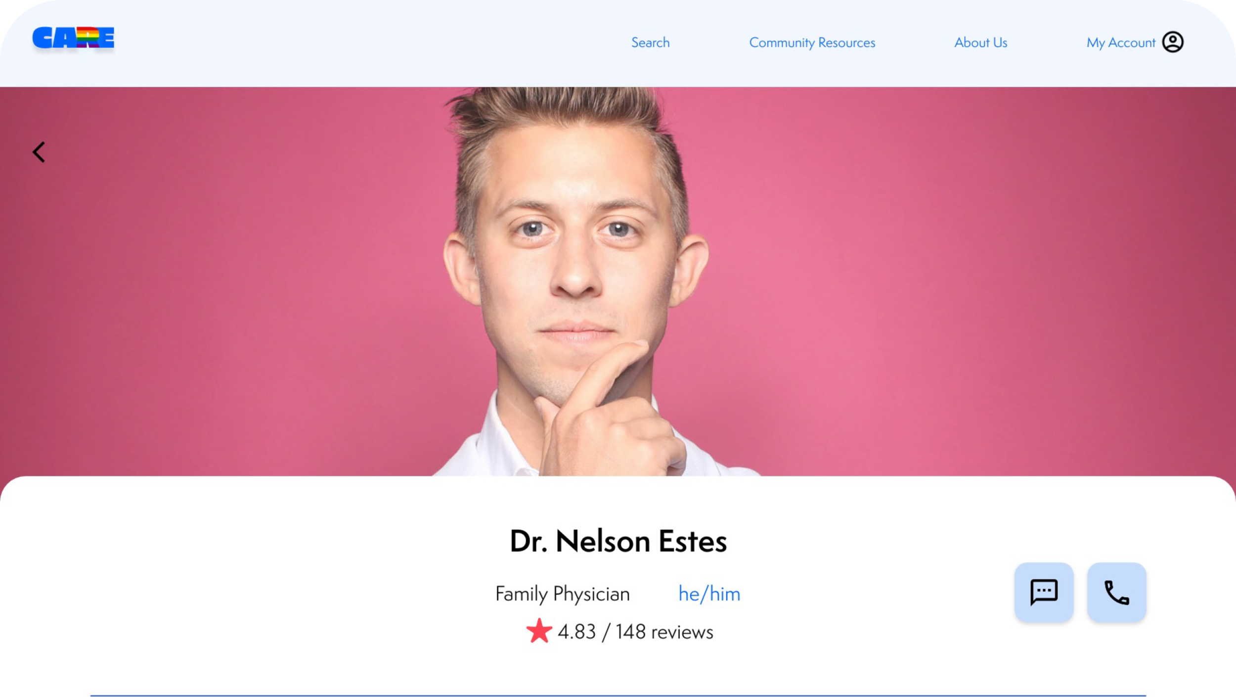
profile page-website
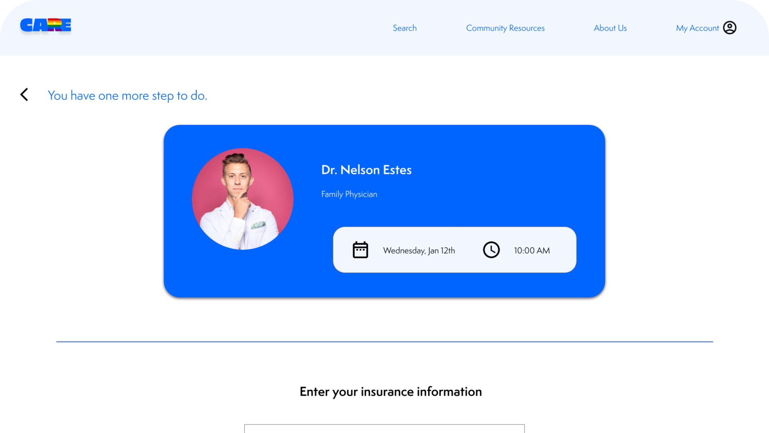
payment page-website
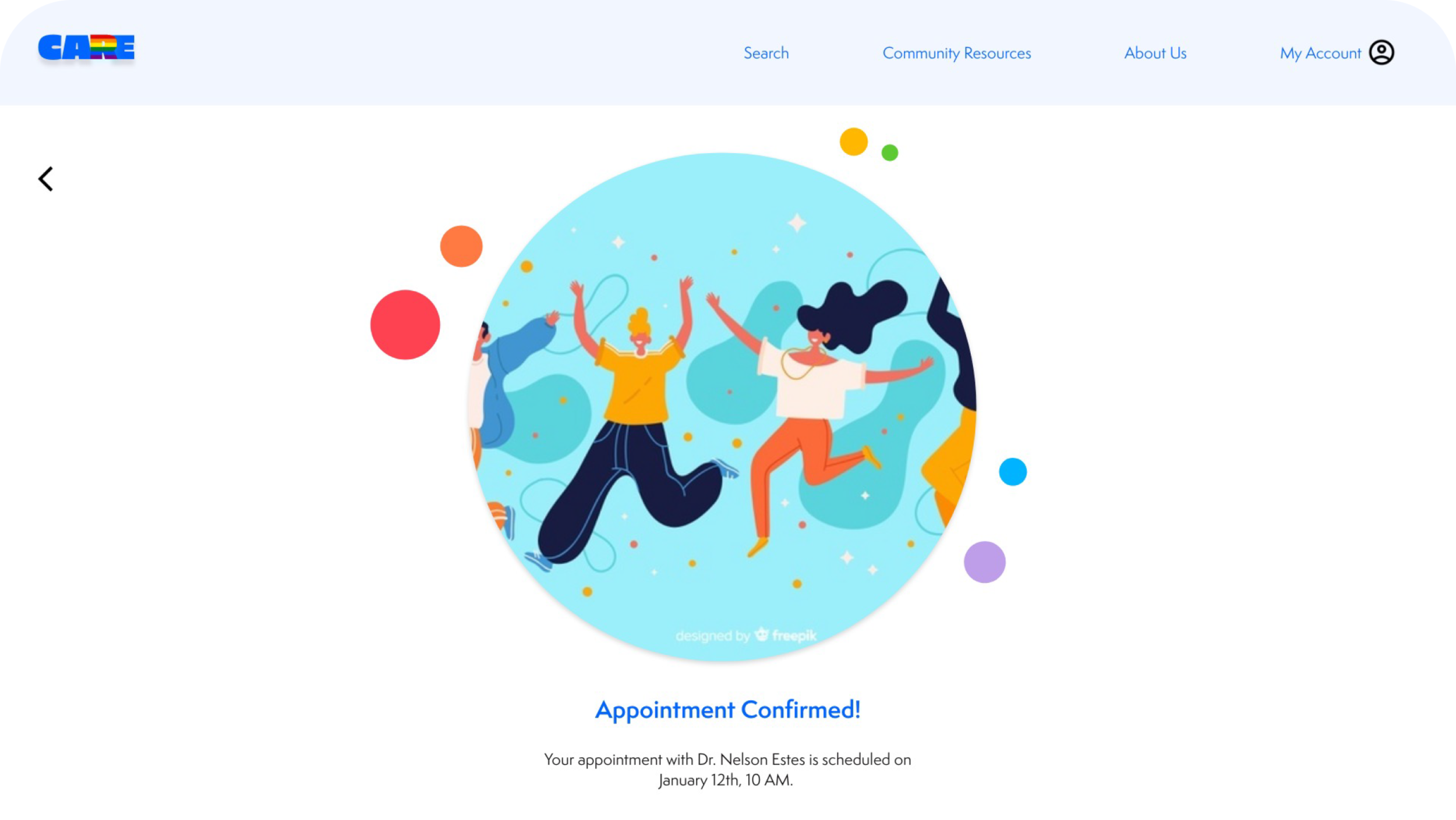
confirmation page-website
Solutions For Design Challenges
Challenge 1: Insufficient Information
I inserted an introduction section in the doctor profiles’ preview cards for users to see each doctor’s pronoun preference and rating in advance. On the main profile page, I included a more detailed rating section, alongside with a brief overview of the doctor’s stats, to provide as much useful information as possible in my design.
Challenge 3: Cluttered Navigation
In order to save time for users to complete the booking process, I took off unnecessary steps, categorized information into sections and added the calendar button for users to easily see in the navigation bar.
Challenge 2: Insurance Coverage
One of the user’s pain points is the in-network insurance coverage for the healthcare services. In order to solve this problem, I added the insurance plan filter for users to add their insurance plans in advance.
Design System
I considered the color psychology: the blue color delivers a sense of calm, safe, and peaceful, which became my primary color for the app interface. Also, I looked back to my competitors to see how they formatted their UI and how did they structure their interface for the home screen. So, considering all these into perspective, I created this design system to stay consistent, and use it within my own UX design.
Takeaways
Impact
Users shared that the app can be used in reality. One quote from peer feedbacks was that “I wish to use this app to book healthcare services in real time.”
What I Learned
I learned that different screen sizes can have varied designs. I understood that it was important to optimize the browsing experience for a range of device sizes.
Working full through this project taught me the importance of trying to think intentionally about every element of the project and how it can contribute to the end results
Next Steps
Conduct research on how successful the app is in supporting local LGBTQ healthcare.
Discover potential user groups, and define success metrics for this product
Communicate with local LGBTQ community to discuss future collaboration opportunities


