FreshGo Online Grocery Shopping
Design Scenario:
You are working on a project for an online grocery retailer. They need a responsive website that allows users to pick from a curated collection of items and have them delivered within 2 hours. The company does not use local grocers, they have their distribution hub in the cities they are located in that is the shipping point for all deliveries. The orders come in, are picked and packed, and then picked up by a driver who then delivers them to the customers. Think Amazon delivery but for grocery.
My Role
UI/UX designer
Duration
May 2024 to Aug 2024
Design Goal
Design a website and a mobile app from scratch, practice design skills including problem-solving, IA, prototyping, UI design skills (interactive and adaptive design), and presentation.
Learning Outcome
Recognize when to use certain tools at different stages of a project lifecycle.
Develop familiarity and comfort in using a variety of digital and analog design tools.
Compare, and contrast the suitability of design and project management tools.
Communicate verbally and visually their toolset knowledge by completing a final project.
Design Tools & Processes
Wireframes
Homepage
1.I first categorized the listed items and then decided on which category I wanted to display for this assignment.
2.I quickly used ChatGPT to come up with a name and a slogan to emphasize fast delivery.
3.Since we don’t need to create wireframes for the food delivery user flow, I used the e-commerce template on Balsamic to build the wireframes.
4.I looked at Walmart, Giants, and Whole Foods for inspiration. I noticed that the top banner was always used for promotions. And the overall layout was divided into rows to display as many items as possible without overwhelming customers.
Category Page
Product Page
Information Architecture
Based on the wireframe I created last week, I was able to quickly sketch an IA, using the information provided for this project and templates I used before.
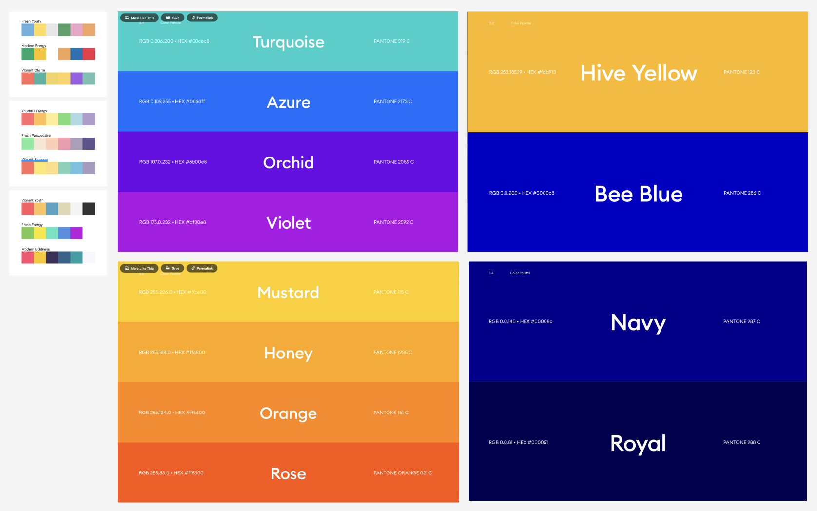
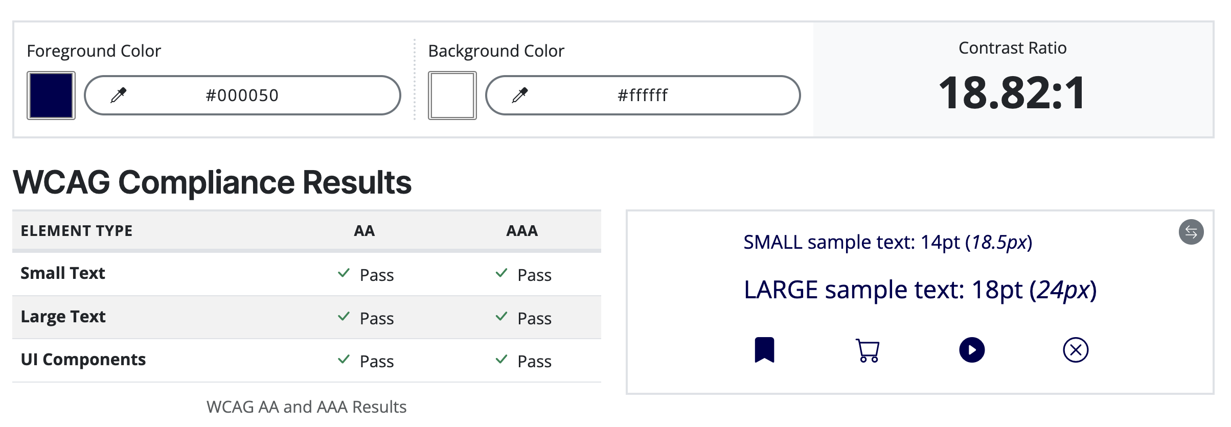
Color Analysis
I ran different color combos in WCAG to ensure that digital content, including color choices, is accessible to all users, including those with disabilities.


UI Design: Mid-Fidelity Wireframes
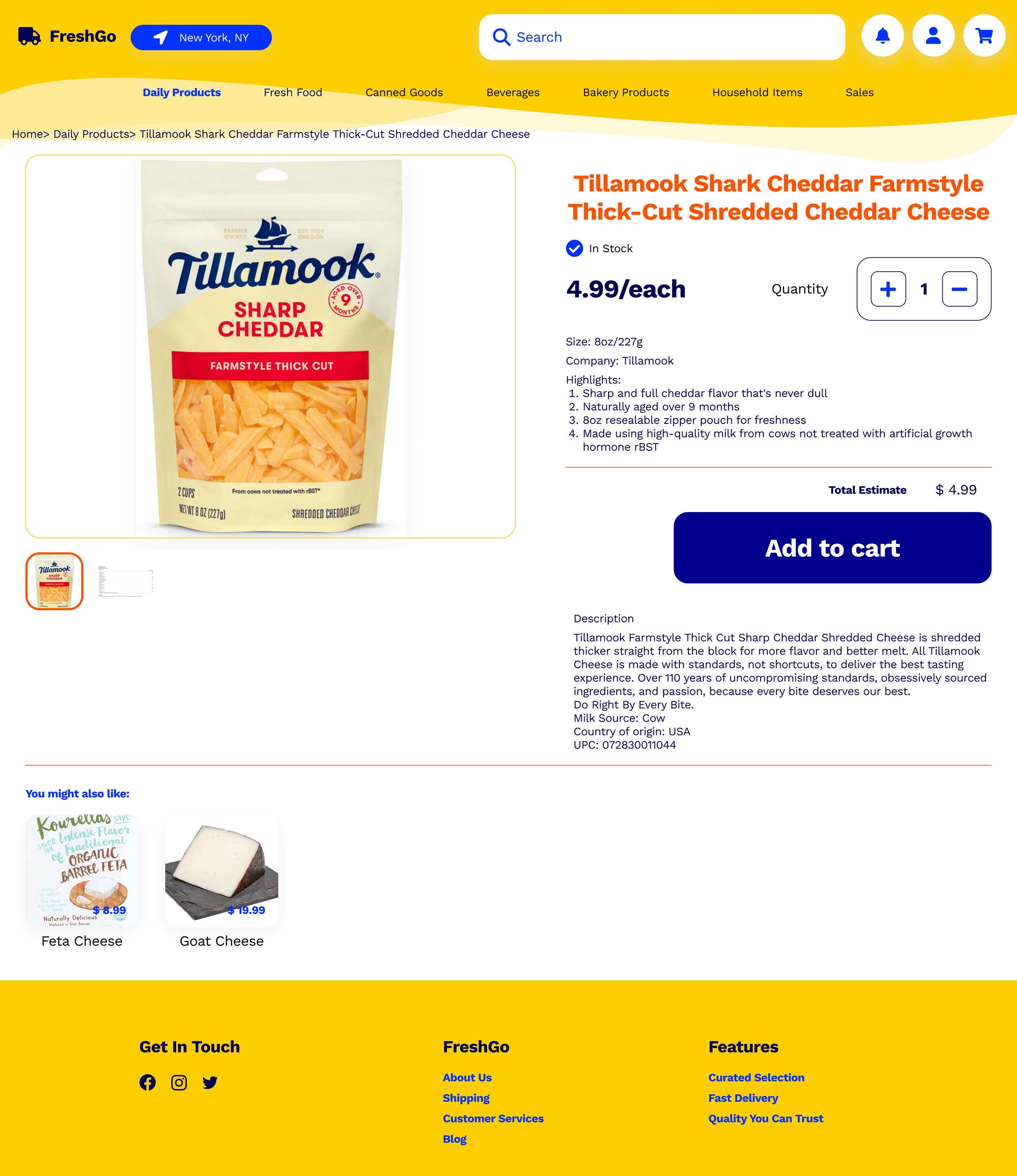
Product Page Draft
I downloaded icons from FontAwesome.
I changed the font sizes according to the visual hierarchy law and design principles, to highlight the important information, such as the price and the product name so that users can understand what they need to focus on the page.
I applied the colors to the draft and added footers at the bottom to complete the page design.
Product Page v1.0
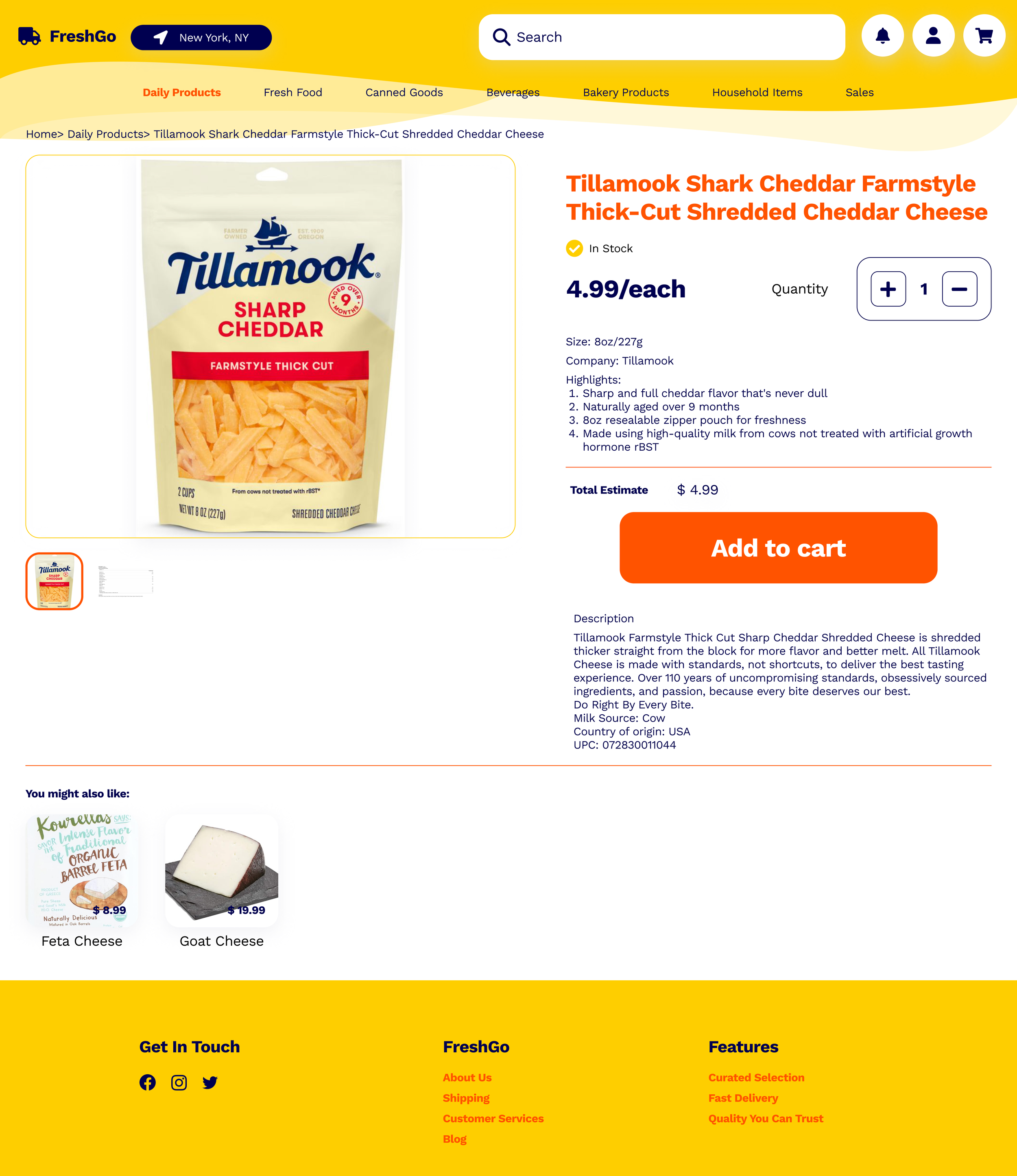
Product Page v2.0
Design Critique
Color Change
Based on the assignment feedback, I took out the blue in my color palette and decided to use dark blue as the primary CTAs.
Navigation
I simplified the design for the top bar so that users can focus on the content.
Overall Visual
There were more small design changes I made to the page, to emphasize the content and the actions users should take, and to make the design more visually harmonious.
Design System & Mid to High-Fidelity Wireframes
Homepage
To re-use the design components I created for the product page, I created a simple design system including the primary colors, components, buttons, and fonts.
Using the design system, I also created interactive designs: the search bar, the adding quantity button, and the filter.
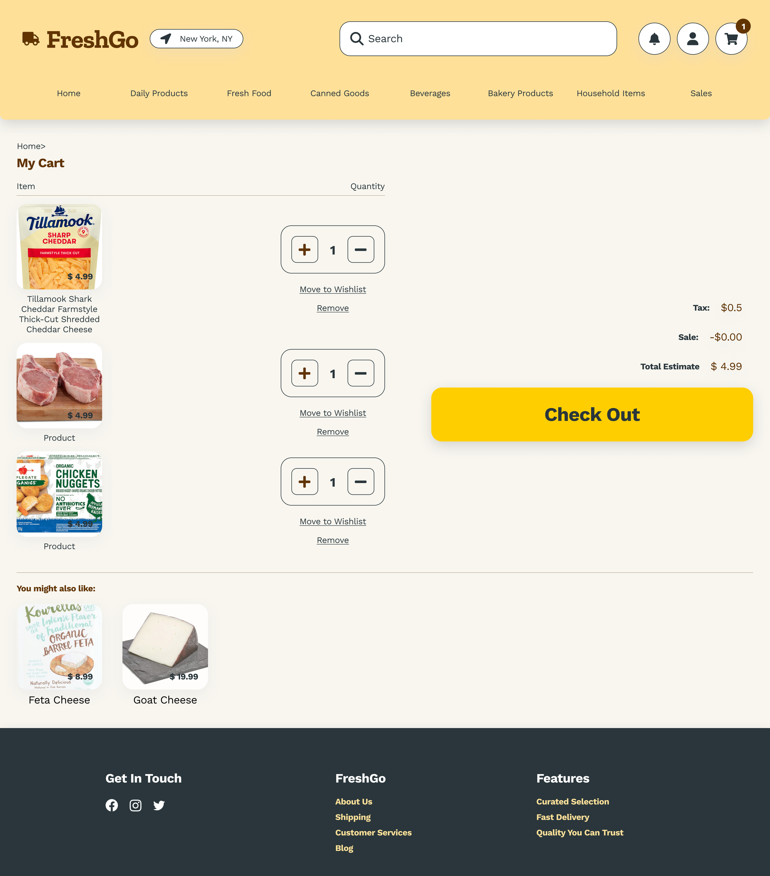
Cart Page
Product Page v3.0
Prototype
After creating 5 main mid-fidelity screens, I connected them to ensure there was a seamless user flow for adding the cheddar cheese item to the shopping cart.
User flow: home page – daily product category page – cheddar cheese product page – pop-up cart page after clicking the “add to cart” button – detailed cart page
Design Critique Round 2
Color Change
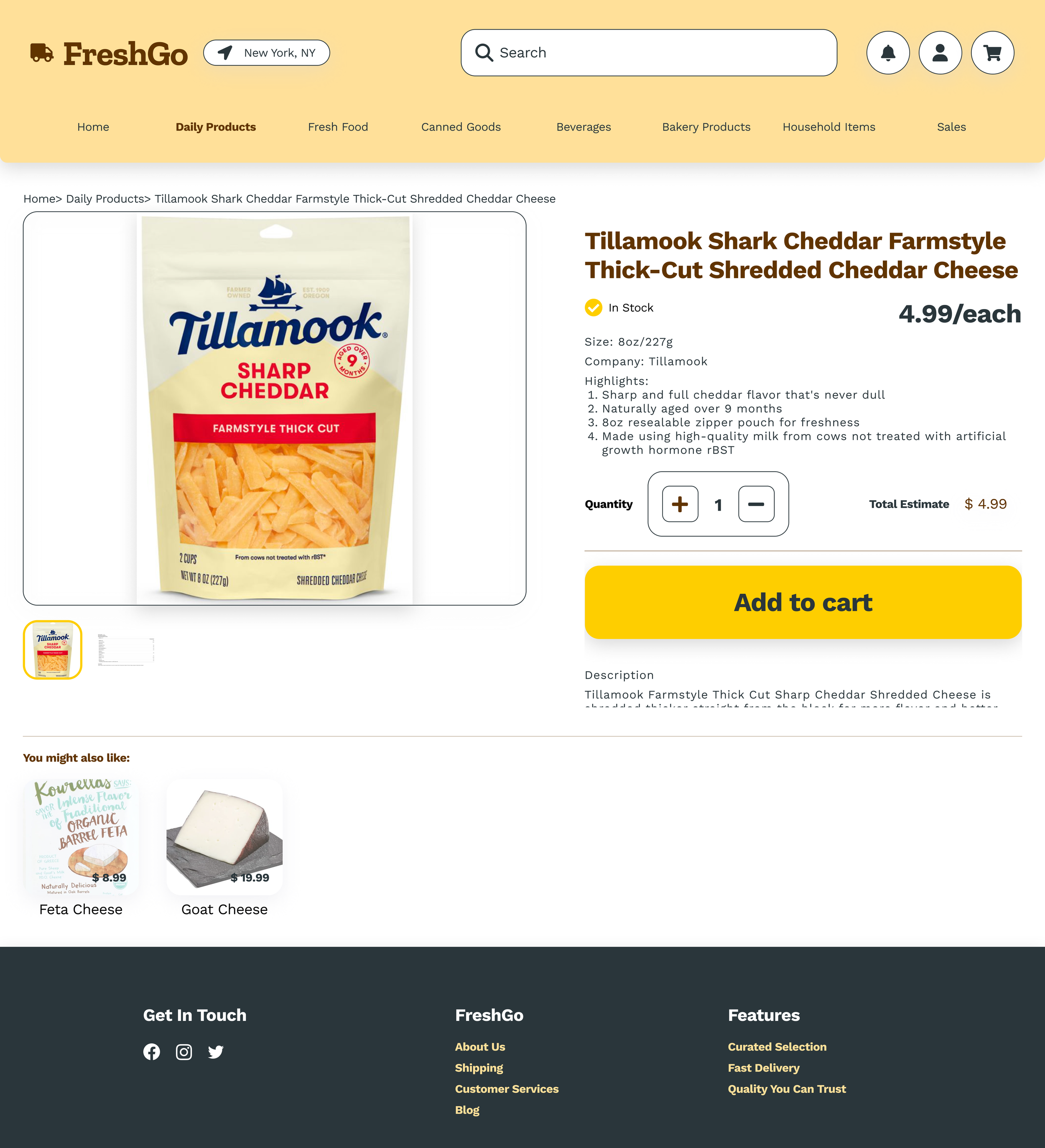
Learned from the last prototype assignment’s feedback, I swapped the darker blue and orange out with dark grey and brown, and added more neutral colors, to ensure all colors could pass conformance.
Shopping Cart
I was aware of the need to re-design the shopping cart so that it could display multiple items in a logical and visually engaging way.
FreshGo Website Mockups
Homepage
Cart Page
Product Page v4.0
Mobile App Sitemap
Moving on to the Mobile App project, when I first had some ideas about how the grocery mobile app should be different from the website, I tried to outline the site map.
I was initially confused about the difference between a website site map and an app site map. After spending some time searching, I learned that:
They are different due to the distinct nature of a website and a mobile app.
Website site maps are typically broader and more hierarchical.
Mobile app site maps are flow-based, emphasizing the key features.
Low-Fidelity Wireframes
To re-use the design components, I adapted certain font sizes and created more text style variants to ensure readability, usability, and a good user experience on smaller mobile screens.
Also adapting designs from the website prototype, I created interactive design components: the top bar, the navigation bar, buttons, etc.
Instead of jumping right into high-fidelity, I started by mapping out the main structure and layout of each page.
This allowed me to identify design issues and correct them before more detailed design work began.
Instead of making a responsive design, I intended to design iterative app elements that were distinct from the website design, such as:
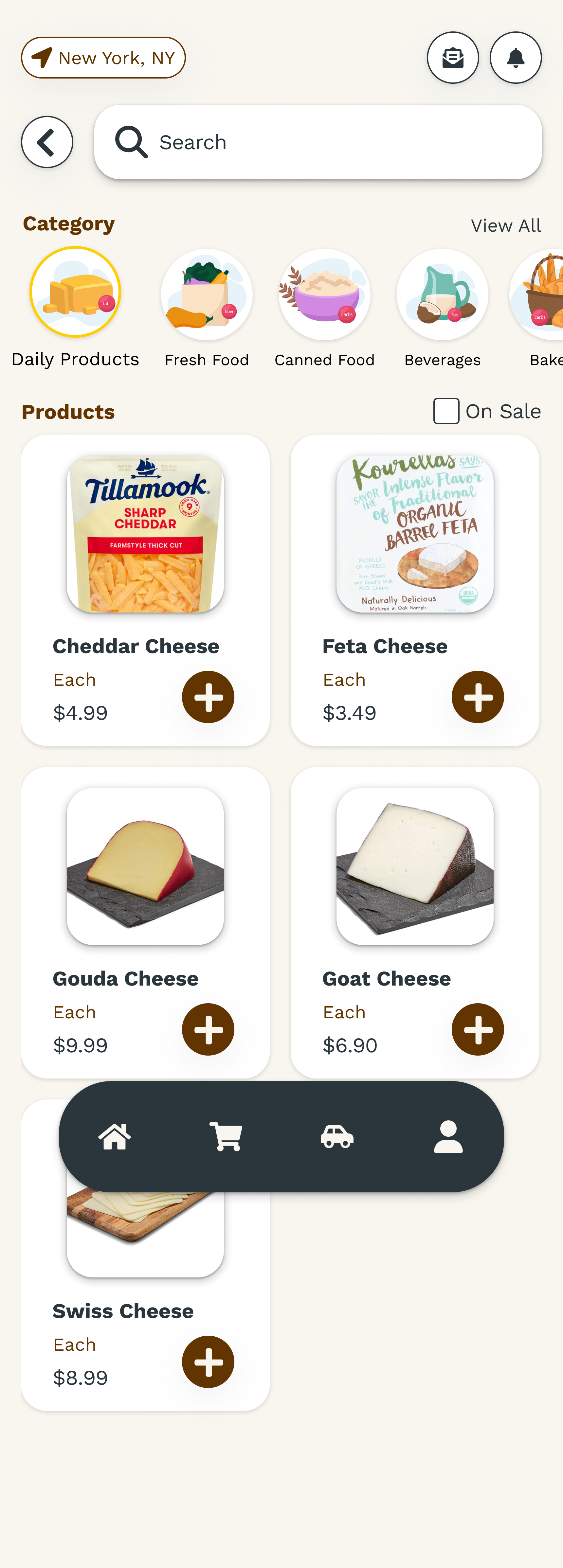
The floating navigation bar
The intensive use of scrolling
Emphasis on the tracking feature
Prototype
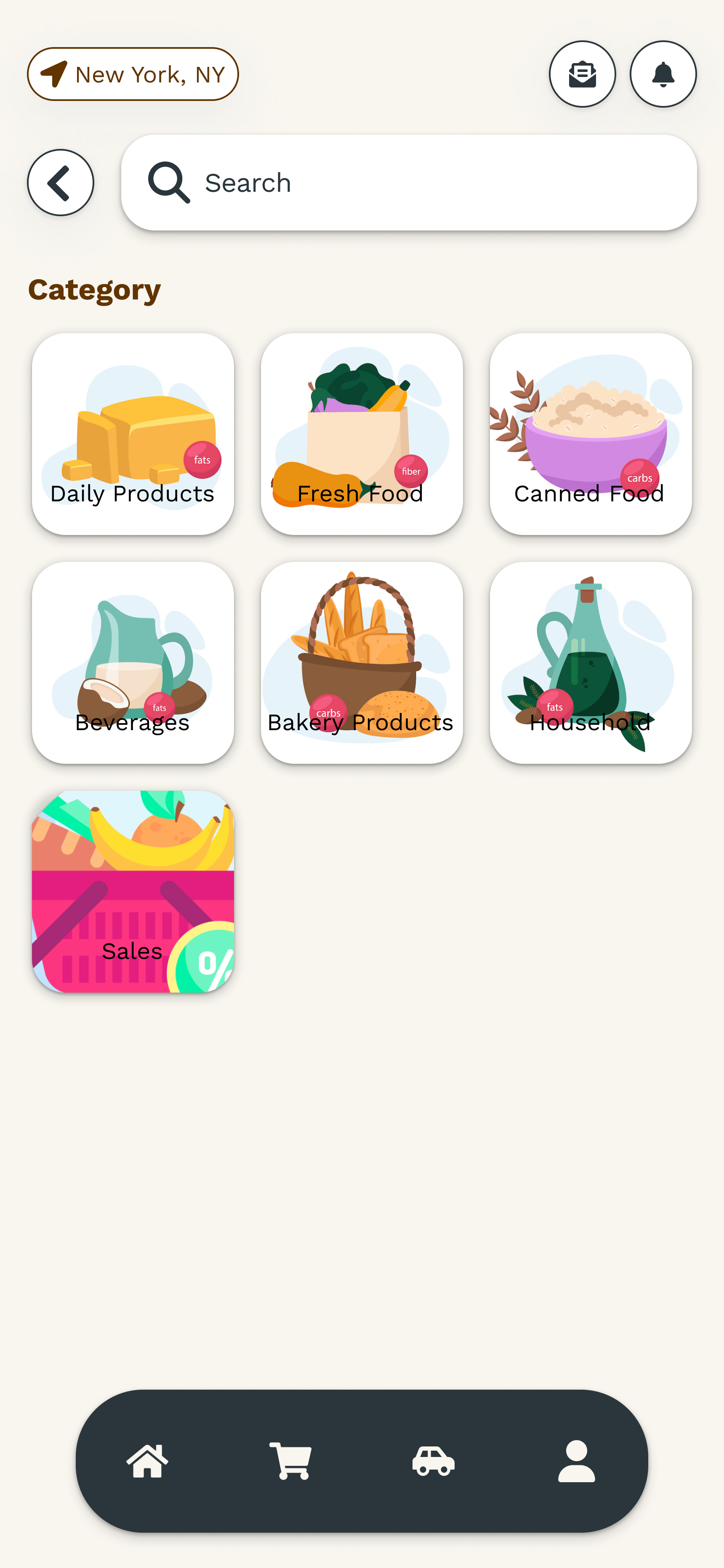
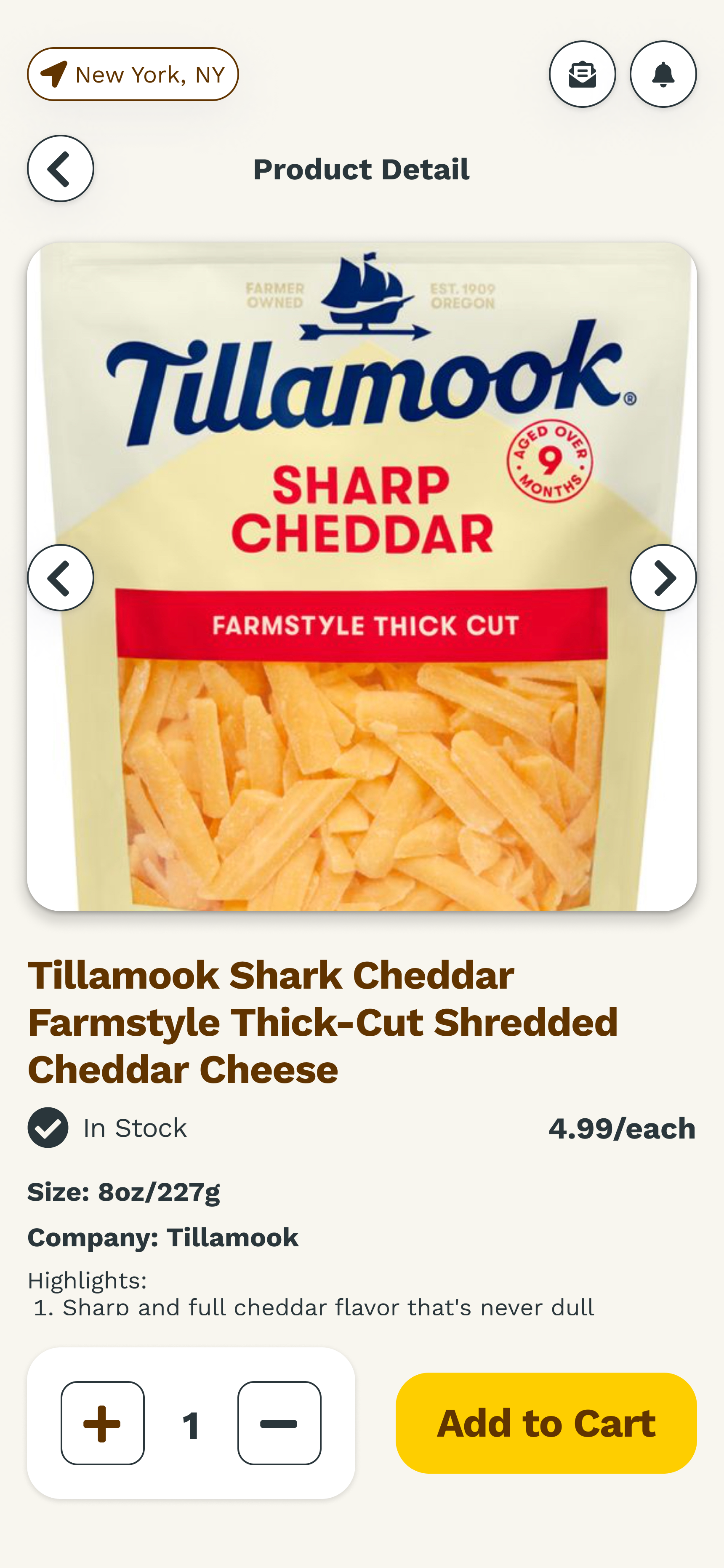
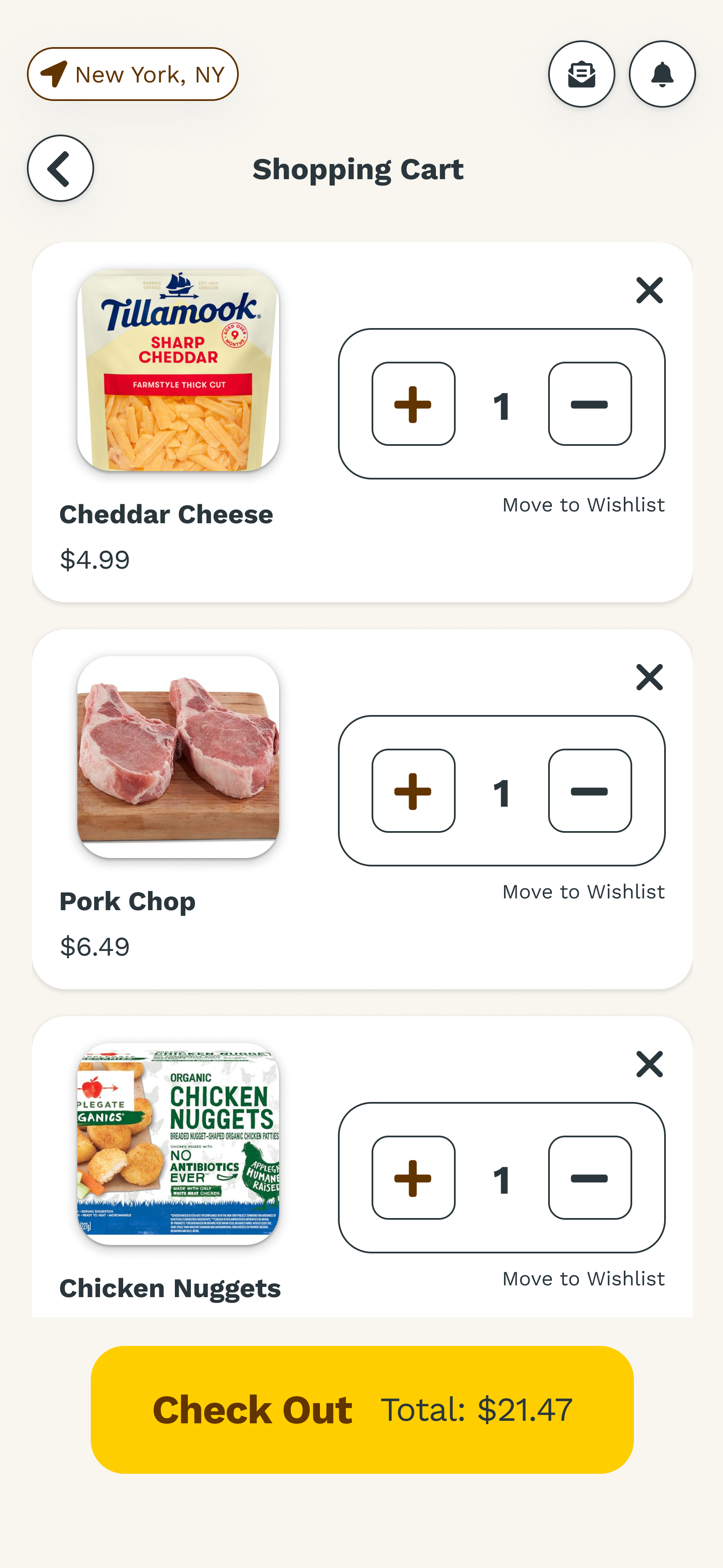
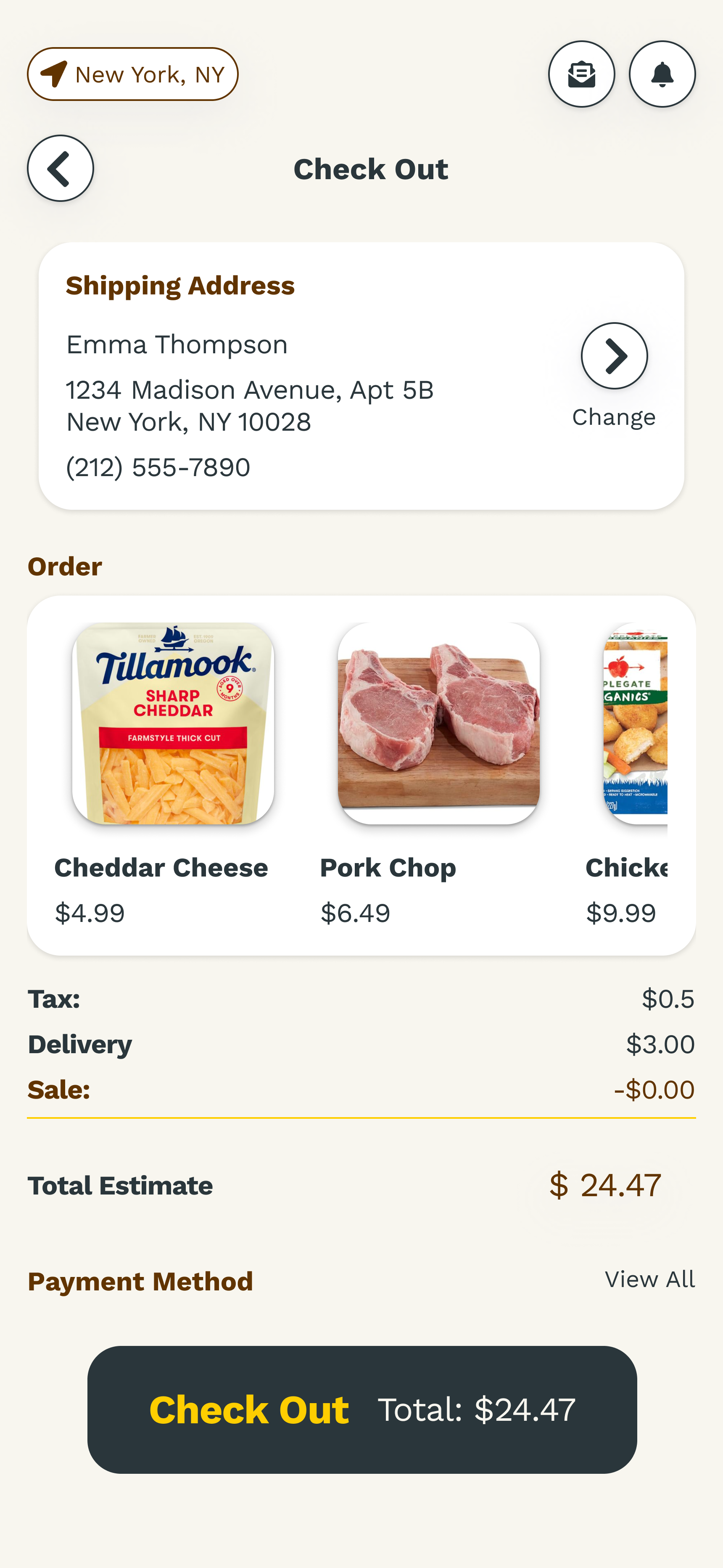
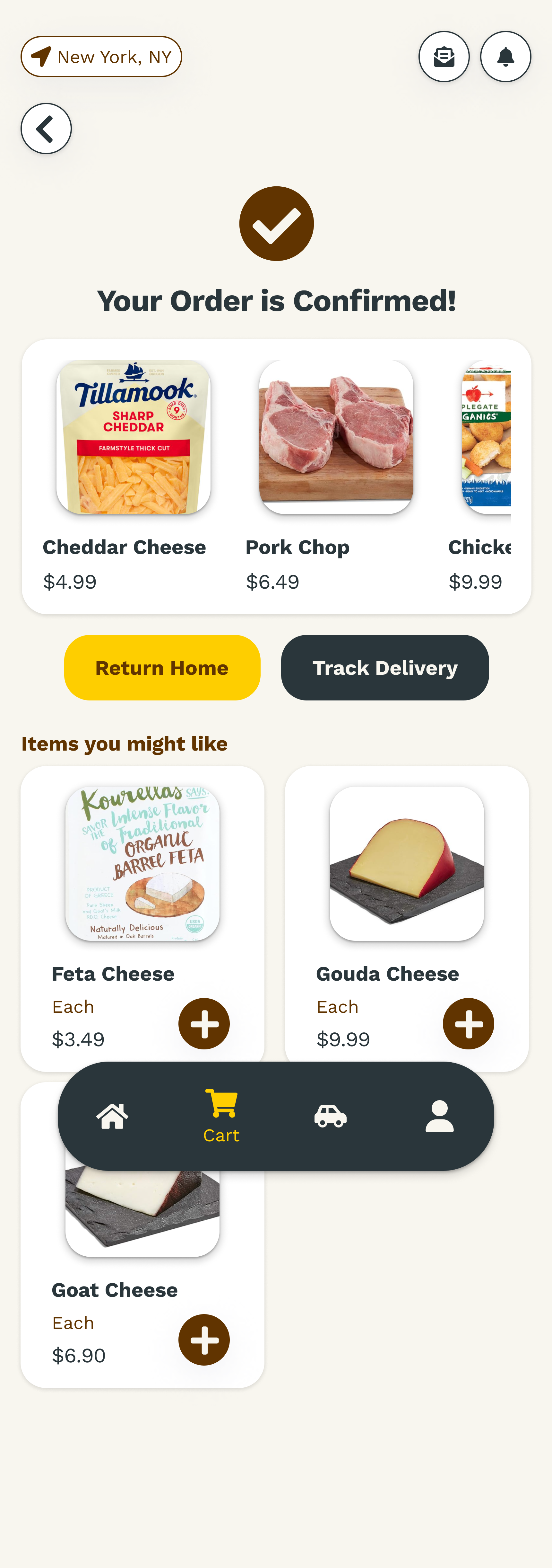
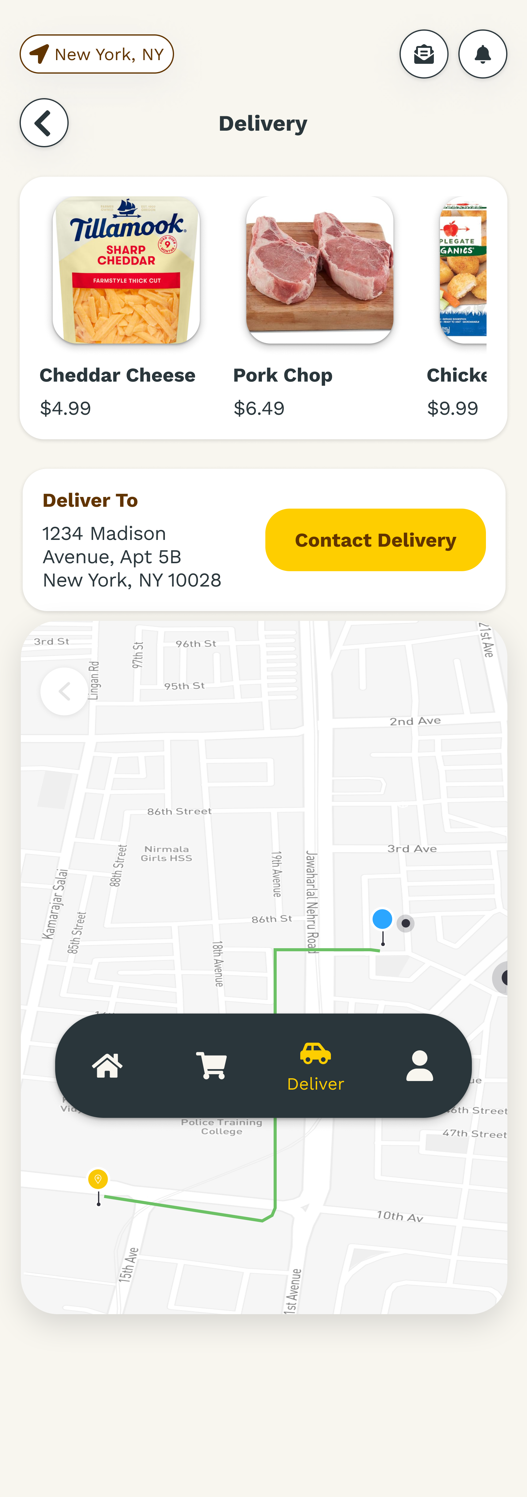
After creating 8 main high-fidelity screens, I connected them to ensure there was a seamless user flow for shopping.
User flow: home page – category page - product category page – cheddar cheese product page – shopping cart – check out– order confirmation - track delivery

Tools
Balsamic
Low to mid-fidelity wireframes
WCAG
Color contrast
Accessibility check
Figma
Mid to high-fidelity wireframes
Mockups
Prototypes


